Typography
Typography is an important aspect of user interface design. XD offers several tags and classes to make it easy to render typographically consistent designs.
Fonts
In general you should avoid specifying specific font families. Instead, allow your text to use the font provided by Adobe XD (which is typically the system font).
If you do need to use a different font, ensure that:
- the font is available on the user's system by picking a safe, commonly installed font.
- avoid using more than two different fonts within a single dialog.
The default font size is dependent upon the platform. macOS tends to render slightly smaller than Windows.
Headings
Headings are used to provide a very distinct, visual statement. These are most often used at the top of dialogs, but can be used within a dialog as well in order to help define areas using a visual hierarchy.
<h1>headings</h1>
<hr />
<h1>Heading Level One</h1>
<h2>Heading Level Two</h2>
<h3>HEADING LEVEL THREE</h3>
In general, the following heading levels are used as follows:
<h1>is used at the top of a dialog, and is typically immediately followed by a horizontal rule (<hr>).<h2>is used within a dialog to separate content.<h3>is used within a dialog to group content, and is typically capitalized.
Text Size
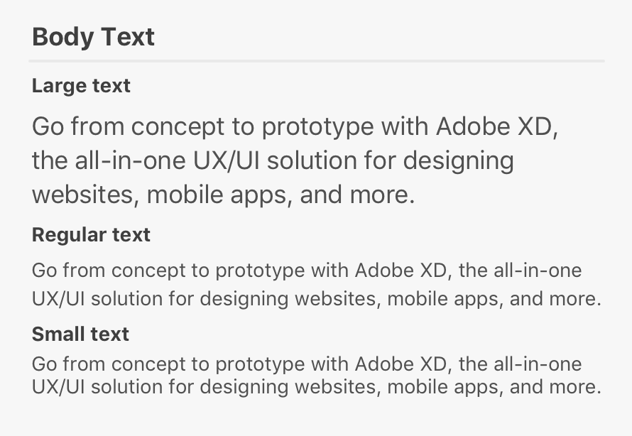
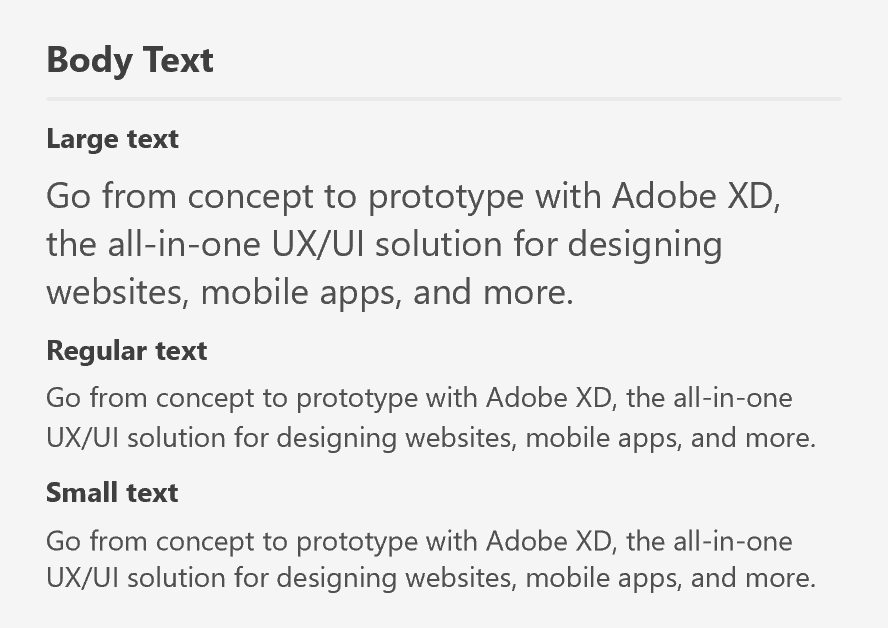
Typically you'll not need to override the basic text size. However, when rendering paragraph content, you may need additional options. There are three different sizes of paragraph text.
<h1>Body Text</h1>
<hr />
<h2>Large text</h2>
<p class="large">Go from concept to prototype with Adobe XD, the all-in-one UX/UI solution for designing websites, mobile apps, and more.</p>
<h2>Regular text</h2>
<p>Go from concept to prototype with Adobe XD, the all-in-one UX/UI solution for designing websites, mobile apps, and more.</p>
<h2>Small text</h2>
<p class="small">Go from concept to prototype with Adobe XD, the all-in-one UX/UI solution for designing websites, mobile apps, and more.</p>
Each size class is for <p> tags only. If you want to render large body text, you can do so using <p class="large">. For small text, use <p class="text">.
Guidelines
Italics
Use italics for emphasis or for image captions.
Underlines
Use underlines for linkable content (that is, links that would open a web browser). Don't use underlines for emphasis.
Paragraph Width
Readability can be drastically reduced when paragraphs are too narrow or too wide. Avoid paragraphs that are narrower than 50 characters (on average) and wider than 120 characters.
Paragraph Length
Keep your content short and to the point to ensure that users don't have difficulty reading and understanding the text.
Indentation
Don't indent paragraphs.


