Block Layout
The default layout system used by the XD User Interface API is block layout. This just means that elements are stacked vertically on top of each other, just like a stack of blocks. Each element will also stretch to fill up the available width in its container.
Where the layout may surprise you is when dealing with elements that would typically receive inline layout semantics. This layout is essentially textual layout; that is, inline elements are laid out as if they were text on a page, flowing and wrapping along.
In XD, all elements use block layout by default. This includes text-based elements like span, a, button, and all others. This can be a little surprising at first, but if the inline element is desired, one can use the Flexbox layout system to simulate some inline aspects.
Let's consider the following HTML:
<style>
     .border {
         border: 1px solid red;
         padding: 4px;
         width: 300px;
     }
     .border * {
         border: 1px solid blue;
         padding: 4px;
         text-align: center;
     }
</style>
<h3>Block, DIVs</h3>
<div class="border">
    <div>A</div><div>B</div><div>C</div>
</div>
<h3>Block, SPANs</h3>
<div class="border">
    <span>A</span><span>B</span><span>C</span>
</div>
<h3>Block, Ps</h3>
<div class="border">
    <p>A</p><p>B</p><p>C</p>
</div>
If you were thinking like a web browser, the first and third div containers would render their contents vertically, but the middle div would render its contents horizontally, essentially treating each span as a letter.
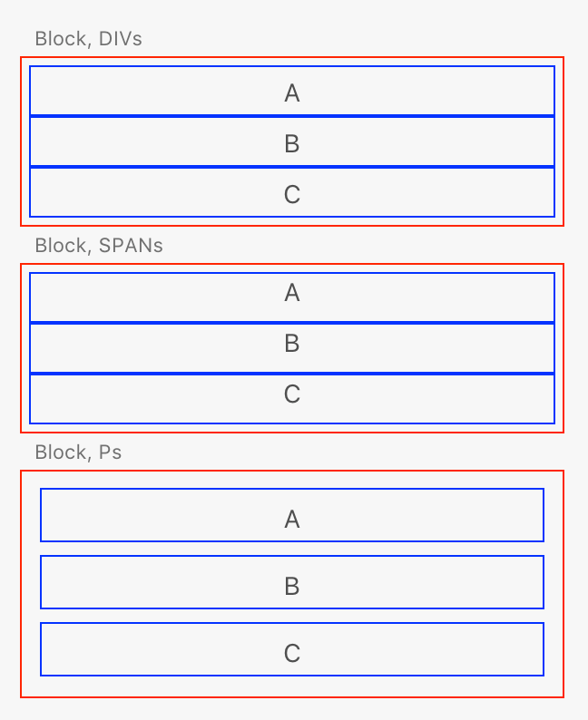
XD, however, will render as follows:

The middle block is rendered vertically as well, even though span elements are inline elements. This is definitely not how a typical web browser would work, but then again, XD isn't a web browser!
