Checkboxes
Checkboxes allow a user to select one or more items from a group (or toggle an individual item on and off). Unlike some other controls, checkboxes only come in a standard variety.
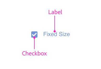
Anatomy


Usage
You can render a checkbox using the following:
<style>
    .row { align-items: center; }
</style>
<label class="row">
    <input type="checkbox" />
    <span>Preserve aspect ratio</span>
</label>
<label class="row">
    <input type="checkbox" checked="true"/>
    <span>Preserve aspect ratio</span>
</label>
const labelWrapper = document.createElement("label");
labelWrapper.className = "row";
labelWrapper.style.alignItems = "center";
const checkbox = document.createElement("input");
checkbox.setAttribute("type", "checkbox");
checkbox.checked = true;
const label = document.createElement("span");
labelWrapper.appendChild(checkbox);
labelWrapper.appendChild(label);function render() {
return (
<div>
<label className="row" style={{alignItems: "center"}}>
<input type="checkbox" />
<span>Preserve aspect ratio</span>
</label>
<label className="row" style={{alignItems: "center"}}>
<input type="checkbox" checked="true"/>
<span>Preserve aspect ratio</span>
</label>
</div>
);
}Indeterminacy
Checkboxes can be in an indeterminate state. This can be set only via the indeterminate property (not an attribute). If set to true, the checkbox will display with a dash instead of a checkmark (or lack thereof).
Indeterminacy is orthogonal to the checkbox's checked state. Changing the checkbox's state will not change the controls indeterminate state.
Keyboard
| Key | Action |
|---|---|
| SPACE | Toggles the checkbox |
| ENTER | Toggles the checkbox |
| TAB | Navigates to the next focusable control |
| SHIFT+TAB | Navigates to the previous focusable control |
Styling
Checkboxes accept a limited amount of styling. You cannot change the following styles:
- Height
- Color of the checkmark or checkbox
Attributes
Supported Attributes
disabledtype:checkboxchecked:trueautofocus:autofocus
Unsupported Attributes
autocompleteformformactionformenctypeformmethodformnovalidateformtargetnamevalue
Supported Events
changeclick
Known Issues
- Checkboxes do not receive keyboard or pointer events.
- Checkboxes may fail to render correctly if in a scrollable container. To work around this issue, make sure the containing element has a background color. (
transparentdoes not count; macOS only.)