Panel
A panel is used to display information and options that are persistent and can be shown without blocking user interactions with the active document.
Panels appear on the left-hand side of the app when user clicks on the Plugins icon at the bottom-left side. Panels do not prevent user interaction with the underlying document and can listen for the user's selection changes. Panels are dismissed in any one of the following manners:
- The user clicks on the "back arrow" button at the top of XD's Plugins panel
- The user clicks on one of the other options for the left hand side of the app, such as the Layers panel or Assets panel
- The user runs a different plugin from the Plugins menu
Usage
Building the user interface for panels is very similar to modals. Refer to Modal dialog usage.
Building Panels
You can build panels using any method that creates an HTML5 DOM structure. This means you can use document.createElement, innerHTML, jQuery, React, and other frameworks.
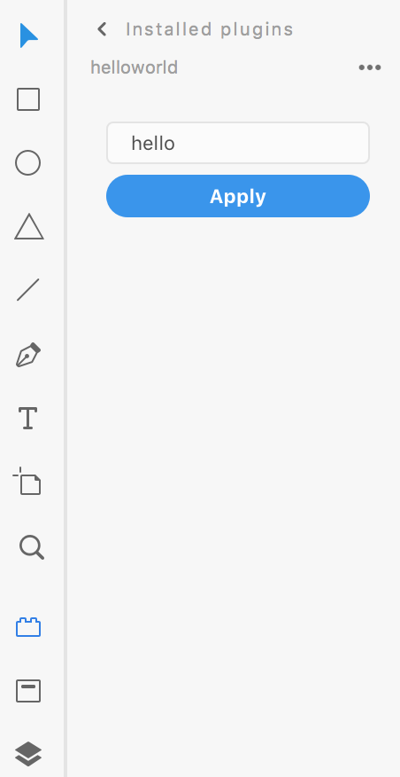
Let's examine a simple panel and how we might create it:
<style>
.break {
flex-wrap: wrap;
}
label.row > * {
margin: 3px 0;
}
label.row > span {
color: #8e8e8e;
width: 20px;
text-align: right;
font-size: 9px;
}
label.row input {
flex: 1 1 auto;
}
label.row input[type="number"] {
flex-basis: 32px;
}
div input[type="checkbox"] {
flex: 0 0 20px;
}
form footer > * {
position: relative;
left: 8px;
}
</style>
<form method="dialog" id="main">
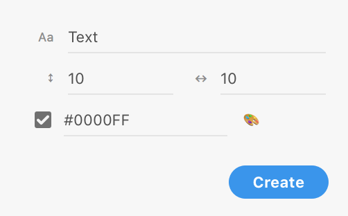
<label class="row" id="fldButtonText">
<span>Aa</span>
<input
type="text"
id="txtButtonText"
value="Text"
placeholder="Text"
uxp-quiet="true"
/>
</label>
<div class="row break">
<label class="row">
<span>↕︎</span>
<input
type="number"
uxp-quiet="true"
id="txtV"
value="10"
placeholder="Vertical padding"
/>
</label>
<label class="row">
<span>↔︎</span>
<input
type="number"
uxp-quiet="true"
id="txtH"
value="10"
placeholder="Horizontal padding"
/>
</label>
<div class="row">
<input type="checkbox" checked id="chkColor" />
<label class="row" id="fldColor">
<input
type="text"
uxp-quiet="true"
id="txtColor"
value="#0000FF"
placeholder="CSS Color"
/>
<span>🎨</span>
</label>
</div>
</div>
<footer>
<button id="ok" type="submit" uxp-variant="cta">Apply</button>
</footer>
</form>let panel;
function create() {
const HTML = `<style>
.break {
flex-wrap: wrap;
}
label.row > * {
margin: 3px 0;
}
label.row > span {
color: #8E8E8E;
width: 20px;
text-align: right;
font-size: 9px;
}
label.row input {
flex: 1 1 auto;
}
label.row input[type=number] {
flex-basis: 32px;
}
div input[type=checkbox] {
flex: 0 0 20px;
}
form footer > * {
position: relative;
left: 8px;
}
</style>
<form method="dialog" id="main">
<label class="row" id="fldButtonText">
<span>Aa</span>
<input type="text" id="txtButtonText" value="Text" placeholder="Text" uxp-quiet="true"/>
</label>
<div class="row break">
<label class="row">
<span>↕︎</span>
<input type="number" uxp-quiet="true" id="txtV" value="10" placeholder="Vertical padding" />
</label>
<label class="row">
<span>↔︎</span>
<input type="number" uxp-quiet="true" id="txtH" value="10" placeholder="Horizontal padding" />
</label>
<div class="row">
<input type="checkbox" checked id="chkColor" />
<label class="row" id="fldColor">
<input type="text" uxp-quiet="true" id="txtColor" value="#0000FF" placeholder="CSS Color" />
<span>🎨</span>
</label>
</div>
</div>
<footer><button id="ok" type="submit" uxp-variant="cta">Apply</button></footer>
</form>
`;
panel = document.createElement("div");
panel.innerHTML = HTML;
return panel;
}
function show(event) {
// create panel the first time it's shown
if (!panel) {
panel = create();
event.node.appendChild(panel);
}
}
function hide(event) {
// in this example, we don't need to do anything when XD hides our panel
}
function update(selection, root) {
console.log(selection.items);
}
module.exports = {
panels: {
example: {
show,
hide,
update
}
}
};Note: you can either reuse your panel's UI nodes, or destroy and recreate the panel each time it's closed. For examples of both approaches, see the detailed documentation on the show() method.
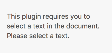
Handling Selection Change
As you can see in the example above, every time the user's selection changes, your (optional) lifecycle method update will trigger. You will have access to both selection and root as parameters in the function. This means that your panel can display dynamic content based on what user has selected in the document.
<style>
  .break {
    flex-wrap: wrap;
  }
  label.row > * {
    margin: 3px 0;
  }
  label.row > span {
    color: #8e8e8e;
    width: 20px;
    text-align: right;
    font-size: 9px;
  }
  label.row input {
    flex: 1 1 auto;
  }
  label.row input[type="number"] {
    flex-basis: 32px;
  }
  div input[type="checkbox"] {
    flex: 0 0 20px;
  }
  form footer > * {
    position: relative;
    left: 8px;
  }
</style>
<form method="dialog" id="main">
  <label class="row" id="fldButtonText">
    <span>Aa</span>
    <input
      type="text"
      id="txtButtonText"
      value="Text"
      placeholder="Text"
      uxp-quiet="true"
    />
  </label>
  <div class="row break">
    <label class="row">
      <span>↕︎</span>
      <input
        type="number"
        uxp-quiet="true"
        id="txtV"
        value="10"
        placeholder="Vertical padding"
      />
    </label>
    <label class="row">
      <span>↔︎</span>
      <input
        type="number"
        uxp-quiet="true"
        id="txtH"
        value="10"
        placeholder="Horizontal padding"
      />
    </label>
    <div class="row">
      <input type="checkbox" checked id="chkColor" />
      <label class="row" id="fldColor">
        <input
          type="text"
          uxp-quiet="true"
          id="txtColor"
          value="#0000FF"
          placeholder="CSS Color"
        />
        <span>🎨</span>
      </label>
    </div>
  </div>
  <footer>
    <button id="ok" type="submit" uxp-variant="cta">Apply</button>
  </footer>
</form>
let panel;
function create() {
const HTML = `<style>
.break {
flex-wrap: wrap;
}
label.row > * {
margin: 3px 0;
}
label.row > span {
color: #8E8E8E;
width: 20px;
text-align: right;
font-size: 9px;
}
label.row input {
flex: 1 1 auto;
}
label.row input[type=number] {
flex-basis: 32px;
}
div input[type=checkbox] {
flex: 0 0 20px;
}
form footer > * {
position: relative;
left: 8px;
}
</style>
<form method="dialog" id="main">
<label class="row" id="fldButtonText">
<span>Aa</span>
<input type="text" id="txtButtonText" value="Text" placeholder="Text" uxp-quiet="true"/>
</label>
<div class="row break">
<label class="row">
<span>↕︎</span>
<input type="number" uxp-quiet="true" id="txtV" value="10" placeholder="Vertical padding" />
</label>
<label class="row">
<span>↔︎</span>
<input type="number" uxp-quiet="true" id="txtH" value="10" placeholder="Horizontal padding" />
</label>
<div class="row">
<input type="checkbox" checked id="chkColor" />
<label class="row" id="fldColor">
<input type="text" uxp-quiet="true" id="txtColor" value="#0000FF" placeholder="CSS Color" />
<span>🎨</span>
</label>
</div>
</div>
<footer><button id="ok" type="submit" uxp-variant="cta">Apply</button></footer>
</form>
`;
panel = document.createElement("div");
panel.innerHTML = HTML;
return panel;
}
function show(event) {
// create panel the first time it's shown
if (!panel) {
panel = create();
event.node.appendChild(panel);
}
}
function hide(event) {
// in this example, we don't need to do anything when XD hides our panel
}
function update(selection, root) {
const { Text } = require("scenegraph");
if (!(selection.items[0] instanceof Text)) {
panel.innerHTML = `<p>Please select a text object.</p>`;
}
}
module.exports = {
panels: {
example: {
show,
hide,
update
}
}
};Further Reading
Refer to the panel lifecycle method documentation to learn more about these methods: