scenegraph
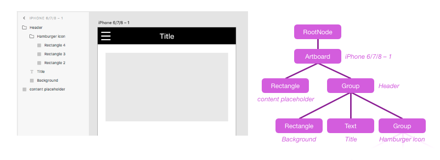
The scenegraph is a node tree which represents the structure of the XD document. It closely matches the hierarchy seen in the Layers panel inside XD. Some scenenodes may contain children (e.g., a Group or Artboard), while others are leaf nodes (e.g., a Rectangle or Text node). The root of the scenegraph contains all Artboards that exist in the document, as well as all pasteboard content (nodes that are not contained by any artboard).
You can modify properties on any scenenodes within the current edit context, and add leaf nodes to the current edit context, but you cannot make structural changes directly to the scenegraph tree. Instead, use commands.
Typically, you access scenegraph nodes via the selection argument that is passed to your plugin command, or by
traversing the entire document tree using the documentRoot argument that is passed to your plugin command. These
objects are also accessible on the scenegraph module for convenience.
Example
function myCommand(selection) {
    let node = selection.items[0];

    console.log("The selected node is a: " + node.constructor.name);

    // Print out types of all child nodes (if any)
    node.children.forEach(function (childNode, i) {
        console.log("Child " + i + " is a " + childNode.constructor.name);
    });
}
To create new scenenodes, load this scenegraph module directly and use the node constructor functions:
Example
let scenegraph = require("scenegraph");
function myCommand(selection) {
    let newShape = new scenegraph.Rectangle();
    newShape.width = 100;
    newShape.height = 50;
    newShape.fill = new Color("red");
    selection.insertionParent.addChild(newShape);
}
Class hierarchy
Note: Additional subclasses may be added in the future. Always be sure to have a default case for unknown scenenode classes when traversing the scenegraph.
Typedefs
Related classes
These classes are not scenenode types, but are used extensively in the scenegraph API:
- Color - Value object for
fill,stroke, and other properties - ImageFill - Value object for
fillproperty - LinearGradientFill - Value object for
fillproperty - Matrix - Value object for
transformproperty - Shadow - Value object for
shadowproperty - Blur - Value object for
blurproperty
Other module members
- selection : !
Selection - root : !
RootNode - getNodeByGUID(guid) ⇒
?SceneNode
scenegraph.selection : !Selection
Object representing the current selection state and edit context. Also available as the first argument passed to your plugin command handler function.
Kind: static property of scenegraph
Read only: true
Since: XD 14
scenegraph.root : !RootNode
Root node of the current document's scenegraph. Also available as the second argument passed to your plugin command handler function.
Kind: static property of scenegraph
Read only: true
Since: XD 14
scenegraph.getNodeByGUID(guid)
Since: XD 28
Returns the scenenode in this document that has the given node GUID. Returns undefined if no such node exists connected to the scenegraph tree (detached/orphan nodes will not be found). This provides a fast way of persistently remembering a node across plugin operations and even across document open/closes.
Kind: static method of scenegraph
Returns: ?SceneNode
| Param | Type | Description |
|---|---|---|
| guid | string | SceneNode GUID -- must be all lowercase, as returned by the guid getter. |
Example
let node = scenegraph.selection.items[0];
let guid = node.guid;

// ...later on:
let sameNode = scenegraph.getNodeByGUID(guid);
if (sameNode) {
    // ^ Always check if node still exists - user may have deleted it
    console.log("Found node again!", sameNode);
}
SceneNode
Kind: abstract class
Base class of all scenegraph nodes. Nodes will always be an instance of some subclass of SceneNode.
- SceneNode
- .guid :
string - .parent :
SceneNode - .children :
!SceneNodeList - .isInArtworkTree :
boolean - .isContainer :
boolean - .selected :
boolean - .visible :
boolean - .opacity :
number - .blendMode :
string - .transform :
!Matrix - .translation :
!{x:number, y:number} - .rotation :
number - .globalBounds : !
Bounds - .localBounds : !
Bounds - .boundsInParent : !
Bounds - .topLeftInParent : !
Point - .localCenterPoint : !
Point - .globalDrawBounds : !
Bounds - .name :
string - .hasDefaultName :
boolean - .locked :
boolean - .markedForExport :
boolean - .fixedWhenScrolling :
?boolean - .triggeredInteractions :
!Arrray<!Interaction> - .horizontalConstraints :
?{position:string, size:string} - .verticalConstraints :
?{position:string, size:string} - .hasCustomConstraints :
boolean - .resetToAutoConstraints()
- .hasLinkedContent :
boolean - .pluginData :
* - .sharedPluginData :
!PerPluginStorage - .removeFromParent()
- .moveInParentCoordinates(deltaX, deltaY)
- .placeInParentCoordinates(registrationPoint, parentPoint)
- .rotateAround(deltaAngle, rotationCenter)
- .resize(width, height)
- .guid :
sceneNode.guid : string
Returns a unique identifier for this node that stays the same when the file is closed & reopened, or if the node is moved to a different part of the document. Cut-Paste will result in a new GUID, however.
The GUID is guaranteed unique within the current document, but other documents may contain the same GUID value. For example, if the user makes a copy of an XD file, both files will use the same GUIDs.
The GUID of the root node changes if the document is duplicated via Save As. See application.activeDocument.guid for details.
Node objects can be destroyed and recreated during operations such as Undo/Redo, so if you need to store a reference to a node even between operations in the same session, it's best to store the GUID and then retrieve the node later via getNodeByGuid().
Kind: instance property of SceneNode
Read only: true
sceneNode.parent : SceneNode
Returns the parent node. Null if this is the root node, or a freshly constructed node which has not been added to a parent yet.
Kind: instance property of SceneNode
Read only: true
sceneNode.children : !SceneNodeList
Returns a list of this node's children. List is length 0 if the node has no children. The first child is lowest in the z order.
This list is not an Array, so you must use at(i) instead of [i] to access children by index. It has a number of Array-like
methods such as forEach() for convenience and improved performance, however.
The list is immutable. Use removeFromParent and addChild to add/remove child nodes.
Kind: instance property of SceneNode
Read only: true
Example
let node = ...;
console.log("Node has " + node.children.length + " children");
console.log("First child: " + node.children.at(0));  // do not use `[0]` - it will not work!

node.children.forEach(function (childNode, i) {
    console.log("Child " + i + " is a " + childNode.constructor.name);
});
sceneNode.isInArtworkTree : boolean
True if the node's parent chain connects back to the document root node.
Kind: instance property of SceneNode
Read only: true
sceneNode.isContainer : boolean
True if this node is a type that could have children (e.g. an Artboard, Group, Boolean Group, etc.).
Kind: instance property of SceneNode
Read only: true
sceneNode.selected : boolean
True if this node is part of the current selection. To get a list of all selected nodes or change which nodes are selected, use selection.
Kind: instance property of SceneNode
Read only: true
See: selection
sceneNode.visible : boolean
False if this node has been hidden by the user (eyeball toggle in Layers panel). If true, the node may still be invisible for other reasons: a parent or grandparent has visible=false, the node has opacity=0%, the node is clipped by a mask, etc.
Kind: instance property of SceneNode
sceneNode.opacity : number (0.0 - 1.0)
Node's opacity setting. The overall visual opacity seen in the document is determined by combining this value with the opacities of the node's entire parent chain, as well as the opacity settings of its fill/stroke properties if this is a leaf node.
Kind: instance property of SceneNode
sceneNode.blendMode : string
Default: BLEND_MODE_PASSTHROUGH
Since: XD 27
Blend mode determines how a node is composited onto the content below it.
One of: SceneNode.BLEND_MODE_PASSTHROUGH, BLEND_MODE_NORMAL, BLEND_MODE_MULTIPLY, BLEND_MODE_DARKEN, BLEND_MODE_COLOR_BURN, BLEND_MODE_LIGHTEN, BLEND_MODE_SCREEN, BLEND_MODE_COLOR_DODGE, BLEND_MODE_OVERLAY, BLEND_MODE_SOFT_LIGHT,
BLEND_MODE_HARD_LIGHT, BLEND_MODE_DIFFERENCE, BLEND_MODE_EXCLUSION, BLEND_MODE_HUE, BLEND_MODE_SATURATION, BLEND_MODE_COLOR, BLEND_MODE_LUMINOSITY.
Note: for leaf nodes (GraphicNode), the XD UI may show leaf nodes as blend mode "Normal" even when the underlying value is BLEND_MODE_PASSTHROUGH. This is because "Pass Through" and "Normal" are essentially equivalent for leaf nodes – they only differ
in appearance when a node has children.
Example
node.blendMode = scenegraph.SceneNode.BLEND_MODE_LUMINOSITY;
Kind: instance property of SceneNode
sceneNode.transform : !Matrix
Affine transform matrix that converts from the node's local coordinate space to its parent's coordinate space. The matrix never has skew or scale components, and if this node is an Artboard the matrix never has rotation either. Rather than reading the raw matrix values directly, it may be easier to use the translation and rotation properties.
To move or resize a node, use the translation property or APIs like placeInParentCoordinates() or rotateAround(). Setting the entire transform matrix directly is not allowed. To resize a node, use resize().
For an overview of node transforms & coordinate systems, see Coordinate spaces.
This getter returns a fresh Matrix each time, so its fields can be mutated by the caller without interfering with the node's state.
Kind: instance property of SceneNode
Read only: true
See
- translation
- rotation
- moveInParentCoordinates
- placeInParentCoordinates
- rotateAround
- globalBounds
- localBounds
- boundsInParent
- topLeftInParent
sceneNode.translation : !{x:number, y:number}
The translate component of this node's transform. Since translation is applied after any rotation in
the transform Matrix, translation occurs along the parent's X/Y axes, not the node's own local X/Y axes. This is equivalent to
the e & f fields in the transform Matrix.
For an overview of node positioning & coordinate systems, see Coordinate spaces.
Kind: instance property of SceneNode
See
sceneNode.rotation : number
The rotation component of this node's transform, in clockwise degrees.
For an overview of node transforms & coordinate systems, see Coordinate spaces.
Kind: instance property of SceneNode
Read only: true
See: rotateAround
sceneNode.globalBounds : !Bounds
The node's path bounds in document-global coordinate space (represented by a bounding box aligned with global X/Y axes). Path bounds match the selection outline seen in the XD, but exclude some visual parts of the node (outer stroke, drop shadow / blur, etc.).
For an overview of node bounding boxes & coordinate systems, see Coordinate spaces.
Kind: instance property of SceneNode
Read only: true
See
sceneNode.localBounds : !Bounds
The node's path bounds in its own local coordinate space. This coordinate space may be rotated and translated relative to the parent's coordinate space. Path bounds match the selection outline seen in XD, but exclude some visual parts of the node (outerstroke, drop shadow / blur, etc.).
The visual top-left of a node's path bounds is located at (localBounds.x, localBounds.y). This value is not necessarily (0,0) in the local coordinate space: for example, a text node's baseline is at y=0 in local coordinates, so the top of the text has a negative y value.
For an overview of node bounding boxes & coordinate systems, see Coordinate spaces.
Kind: instance property of SceneNode
Read only: true
See
sceneNode.boundsInParent : !Bounds
The node's path bounds in its parent's coordinate space (represented by a bounding box aligned with the parent's X/Y axes - so if the node has rotation, the top-left of the node is not necessarily located at the top-left of boundsInParent). Path bounds match the selection outline seen in XD, but exclude some visual parts of the node (outer stroke, drop shadow / blur, etc.).
For an overview of node bounding boxes & coordinate systems, see Coordinate spaces.
Kind: instance property of SceneNode
Read only: true
See
sceneNode.topLeftInParent : !Point
The position of the node's upper-left corner (localBounds.x, localBounds.y) in its parent's coordinate space. If the node is
rotated, this is not the same as the top-left corner of boundsInParent.
This is a shortcut for node.transform.transformPoint({x: node.localBounds.x, y: node.localBounds.y})
For an overview of node bounding boxes & coordinate systems, see Coordinate spaces.
Kind: instance property of SceneNode
Read only: true
See
sceneNode.localCenterPoint : !Point
The position of the node's centerpoint in its own local coordinate space. Useful as an argument to rotateAround.
This is a shortcut for {x: localBounds.x + localBounds.width/2, y: localBounds.y + localBounds.height/2})
For an overview of node bounding boxes & coordinate systems, see Coordinate spaces.
Kind: instance property of SceneNode
Read only: true
See: localBounds
sceneNode.globalDrawBounds : !Bounds
The node's draw bounds in document-global coordinate space. Draw bounds are larger than the selection outline seen in XD, including outer stroke, drop shadow / blur, etc. - every visible pixel of the node is encompassed by these bounds. This matches the image dimensions if the node is exported as a PNG/JPEG bitmap.
For an overview of node bounding boxes & coordinate systems, see Coordinate spaces.
Kind: instance property of SceneNode
Read only: true
See
sceneNode.name : string
Node name as seen in the Layers panel. Also used as filename during Export.
Setting this property will cause hasDefaultName to become false.
Kind: instance property of SceneNode
sceneNode.hasDefaultName : boolean
True if name is a generic, auto-generated string (e.g. "Rectangle 5"). False if name has been explicitly set.
Kind: instance property of SceneNode
Read only: true
sceneNode.locked : boolean
True if the node is locked, meaning it cannot normally be selected.
Kind: instance property of SceneNode
sceneNode.markedForExport : boolean
True if the node should be included in the output of File > Export > Batch and other bulk-export workflows.
Kind: instance property of SceneNode
sceneNode.fixedWhenScrolling : ?boolean
Since: XD 19
True if the node stays in a fixed position while the Artboard's content is scrolling (when viewed in an interactive prototype). Only applicable for nodes whose immediate parent is an Artboard – this does not apply to content inside a ScrollableGroup!
For other nodes, this property returns undefined and cannot be set. To determine whether those nodes scroll or remain fixed, walk up the parent chain and check this property on the topmost ancestor in the Artboard.
Kind: instance property of SceneNode
See: Artboard.viewportHeight
sceneNode.triggeredInteractions : !Arrray<!Interaction>
Since: XD 19
Get all interactions that are triggered by this node in the document's interactive prototype. Each element in the array is an Interaction object which describes a gesture/event plus the action it produces.
Note: If this node (or one of its ancestors) has visible = false, tap and drag interactions on it will not be triggered.
Currently, this API excludes some types of interactions: keypress/gamepad, scrolling, hover, component state transitions, or non-speech audio playback.
Example
// Print all the interactions triggered by a node
node.triggeredInteractions.forEach(interaction => {
    console.log("Trigger: " + interaction.trigger.type + " -> Action: " + interaction.action.type);
});
Kind: instance property of SceneNode
Read only: true
See: interactions.allInteractions
sceneNode.horizontalConstraints : ?{position:string, size:string}
Since: XD 29
Horizontal dynamic-layout settings used with the Responsive Resize feature. Setting this only determines how the node is updated when its parent is resized – it does not change the node's current size or position.
| Property | Type | Description |
|---|---|---|
| horizontalConstraints.position | string | Horizontal position anchoring, one of SceneNode.FIXED_LEFT, FIXED_RIGHT, FIXED_BOTH or POSITION_PROPORTIONAL.FIXED_BOTH sets fixed left & right offsets, so it always implies size: SIZE_RESIZES (similar to setting both left & right in CSS).POSITION_PROPORTIONAL holds node position at a fixed percentage of the parent's width -- the same positioning behavior you'd get if Responsive Resize is turned off entirely. |
| horizontalConstraints.size | string | Horizontal sizing behavior, either SceneNode.SIZE_FIXED or SceneNode.SIZE_RESIZES.SIZE_FIXED cannot be used with position: FIXED_BOTH, since it is impossible to fix both left & right edges without resizing when the parent resizes.SIZE_RESIZES can be used with any position setting. With position: FIXED_BOTH, the node's size always equals the parent's size minus the fixed left & right offsets. With other position settings, the node's size maintains a fixed percentage of the parent's size. |
Both fields must be provided together when setting this property.
Returns undefined if node's parent is a container where Responsive Resize is unavailable:
- Certain containers such as RepeatGrid and the pasteboard (scenegraph root) do not support Responsive Resize.
- Container may have Responsive Resize layout explicitly turned off (see
dynamicLayoutflag).
Attempting to set this property when Responsive Resize is unavailable results in an error.
Setting this property will cause hasCustomConstraints to become true.
Example
let node = selection.items[0];
node.horizontalConstraints = { position: scenegraph.SceneNode.FIXED_LEFT, size: scenegraph.SceneNode.SIZE_FIXED };
Kind: instance property of SceneNode
sceneNode.verticalConstraints : ?{position:string, size:string}
Since: XD 29
Vertical dynamic-layout settings used with the Responsive Resize feature. Setting this only determines how the node is updated when its parent is resized – it does not change the node's current size or position.
| Property | Type | Description |
|---|---|---|
| verticalConstraints.position | string | Vertical position anchoring, one of SceneNode.FIXED_TOP, FIXED_BOTTOM, FIXED_BOTH or POSITION_PROPORTIONAL.For details, see horizontalConstraints above. |
| verticalConstraints.size | string | Vertical sizing behavior, either SceneNode.SIZE_FIXED or SceneNode.SIZE_RESIZES.For details, see horizontalConstraints above. |
Both fields must be provided together when setting this property.
See horizontalConstraints above for other important notes.
Example
let node = selection.items[0];
node.verticalConstraints = { position: scenegraph.SceneNode.FIXED_TOP, size: scenegraph.SceneNode.SIZE_RESIZES };
Kind: instance property of SceneNode
sceneNode.hasCustomConstraints : boolean
Since: XD 29
True if this node's Responsive Resize layout settings, which are normally automatically inferred by XD, have been overridden with specific desired values. Constraints on a node are either all overridden, or all automatic – never mixed.
If false, each time the parent resizes XD will automatically guess the best layout settings to used based on the current size & position of this node within its parent. You can use the horizontalConstraints and verticalConstraints getters to check what computed settings XD would use based on the node's current size & position.
Automatically becomes true any time you set horizontalConstraints or verticalConstraints. To reset to false, call resetToAutoConstraints().
Kind: instance property of SceneNode
Read only: true (but is modified indirectly; see above)
sceneNode.resetToAutoConstraints()
Since: XD 29
Erase any overridden Responsive Resize layout settings, restoring the default behavior where XD will automatically guess the best layout settings for this node the next time its parent is resized. This function does not change the node's current size & position, however.
Calling this will cause hasCustomConstraints to become false.
Kind: instance method of SceneNode
sceneNode.hasLinkedContent : boolean
True if the node's appearance comes from a link to an external resource, such as Creative Cloud Libraries or a separate XD document (in the case of a Linked Component instance).
Kind: instance property of SceneNode
Read only: true
sceneNode.pluginData : *
Since: XD 14
Metadata specific to your plugin. Must be a value which can be converted to a JSON string, or undefined to clear the stored metadata on this node.
Metadata is persisted with the document when it is saved. Duplicating a node (including across documents, via copy-paste) will duplicate the metadata with it. If the node lies within a Component or Repeat Grid, all instances of the node will have identical metadata (changes in one copy will automatically be synced to the other copy).
To store general metadata for the document overall, set pluginData on the root node of the scenegraph. Metadata on the root node can be changed from any edit context.
Metadata stored in pluginData cannot be accessed by other plugins – each plugin has its own isolated storage. To share metadata
with other plugins, use sharedPluginData.
Kind: instance property of SceneNode
sceneNode.sharedPluginData : !PerPluginStorage
Since: XD 29
Metadata storage accessible by other plugins, separated into silos by plugin ID. Your plugin can read & write the storage for its own plugin ID, but storage for other plugin IDs is read-only. This property returns a PerPluginStorage API object.
Each scenenode has its own metadata storage. To store general metadata that is not specific to one scenenode, use sharedPluginData on the
document's scenegraph root.
Metadata is persisted with the document when it is saved. See pluginMetadata for info on how metadata is duplicated when nodes are
copied or synced.
Kind: instance property of SceneNode
sceneNode.removeFromParent()
Remove this node from its parent, effectively deleting it from the document.
Kind: instance method of SceneNode
sceneNode.moveInParentCoordinates(deltaX, deltaY)
Move the node by the given number of pixels along the parent's X/Y axes (if this node has no rotation, this is identical to moving the node along its own local X/Y axes). This is equivalent to modifying the value returned by 'translation' and then setting it back.
For an overview of node positioning & coordinate systems, see Coordinate spaces.
Kind: instance method of SceneNode
See
| Param | Type |
|---|---|
| deltaX | number |
| deltaY | number |
sceneNode.placeInParentCoordinates(registrationPoint, parentPoint)
Move the node so the given point in its local coordinates is placed at the given point in its parent's coordinates (taking into account any rotation on this node, etc.).
For an overview of node positioning & coordinate systems, see Coordinate spaces.
Kind: instance method of SceneNode
| Param | Type | Description |
|---|---|---|
| registrationPoint | !Point |
Point in this node's local coordinate space to align with parentPoint |
| parentPoint | !Point |
Point in this node's parent's coordinate space to move registrationPoint to |
Example
// Place this node's top-left corner at the centerpoint of its parent
let parentCenter = node.parent.localCenterPoint;  // parent's center in parent's coordinates
let nodeBounds = node.localBounds;  // node's bounds in its own local coordinates
let nodeTopLeft = {x: nodeBounds.x, y: nodeBounds.y};  // node's top left corner in its own local coordinates
node.placeInParentCoordinates(nodeTopLeft, parentCenter);
sceneNode.rotateAround(deltaAngle, rotationCenter)
Rotate the node clockwise by the given number of degrees around the given point in the plugin's local coordinate space. If this node already has nonzero rotation, this operation adds to its existing angle.
For an overview of node transforms & coordinate systems, see Coordinate spaces.
Kind: instance method of SceneNode
See: rotation
| Param | Type | Description |
|---|---|---|
| deltaAngle | number |
In degrees. |
| rotationCenter | Point |
Point to rotate around, in node's local coordinates. |
Example
// Rotate the node 45 degrees clockwise around its centerpoint
node.rotateAround(45, node.localCenterPoint);

// Ignoring the node's previous angle, set its rotation to exactly 180 degrees
let rotationDelta = 180 - node.rotation;
node.rotateAround(rotationDelta, node.localCenterPoint);
sceneNode.resize(width, height)
Attempts to change localBounds.width & height to match the specified sizes. The result is not guaranteed to
match your requested size, since some nodes have limits on their ability to resize.
Note that resizing is different from simply rescaling the content:
- Styles like stroke weight and corner radius stay the same size, so the ratio of their size relative to the resized shape will change.
- If this node is a Group, resizing may invoke XD's Responsive Resize feature, which rearranges items using a fluid layout and may change only the position (not size) of some children.
- Some content cannot be resized at all, or cannot stretch to change its aspect ratio.
Rescaling, by contrast, is the effect seen when you zoom in on the view in XD, or when you export a node at a higher DPI multiplier.
Note: Currenty this function does not respect the "aspect ratio lock" setting in XD's Properties panel. This may be changed/fixed later.
Kind: instance method of SceneNode
| Param | Type |
|---|---|
| width | number |
| height | number |
Example
// Double the width of this node
let originalBounds = node.localBounds;
node.resize(originalBounds.width * 2, originalBounds.height);
RootNode
Kind: class
Extends: SceneNode
Class representing the root node of the document. All Artboards are children of this node, as well as any pasteboard content that does not lie within an Artboard. Artboards must be grouped contiguously at the bottom of this node's z order. The root node has no visual appearance of its own.
Group
Kind: class
Extends: SceneNode
Group nodes represent two types of simple containers in XD:
- Plain Groups, created by the Object > Group command
- Masked Groups, created by the Object > Mask With Shape command
You can determine whether a group is masked by checking the
maskproperty.
Groups and other containers cannot be created directly using scenenode constructors, since you can't add a populated Group to the scenegraph (you can't add subtrees all at once) nor can you add an empty Group and then add children to it (can't add nodes outside the scope of the current edit context). Instead, to create Groups and other nested structures, use commands.
Plain Groups (as well as some other node types, like SymbolInstances) can have dynamic layout features enabled such as padding and stack layouts. These are sometimes referred to as Content-Aware Groups or Stack containers, but ultimately these appear in the API as plain Group nodes. They do not carry the same edit-context restrictions as Masked Groups or other special node types.
In a Mask Group, the mask shape is included in the group's children list, at the top of the z order. It is not visible - only its
path outline is used, for clipping the group.
Example
let commands = require("commands");

// Newly created shape nodes
let shape1 = ...,
    shape2 = ...;

// Add both nodes to the current edit context first
selection.insertionParent.addChild(shape1);
selection.insertionParent.addChild(shape2);

// Select both shapes, then run the Group command
selection.items = [shape1, shape2];
commands.group();
let group = selection.items[0];  // selection has been set to the new Group node afterward
group.addChild(node, index)
Adds a child node to this container node. You can only add leaf nodes this way; to create structured subtrees of content, use commands.
Kind: instance method of Group and other container nodes
| Param | Type | Description |
|---|---|---|
| node | !SceneNode |
Child to add |
| index | ?number |
Optional: index to insert child at. Child is appended to end of children list (top of z order) otherwise. |
group.addChildAfter(node, relativeTo)
Inserts a child node after the given reference node.
Kind: instance method of Group and other container nodes
| Param | Type | Description |
|---|---|---|
| node | !SceneNode |
Child to add |
| relativeTo | !SceneNode |
New child is added immediately after this existing child |
group.addChildBefore(node, relativeTo)
Inserts a child node before the given reference node.
Kind: instance method of Group and other container nodes
| Param | Type | Description |
|---|---|---|
| node | !SceneNode |
Child to add |
| relativeTo | !SceneNode |
New child is added immediately before this existing child |
group.removeAllChildren()
Removes all children from this node. Equivalent to calling removeFromParent() on each child in turn, but faster.
Kind: instance method of Group and other container nodes
group.dynamicLayout : ?boolean
Since: XD 29
If true, Responsive Resize is enabled, and this node's children will use an intelligent layout algorithm whenever this node is resized.
Returns undefined on node types that do not support Responsive Resize (such as RepeatGrid; see horizontalConstraints docs for a
complete list). Attempting to set this property on such node types results in an error.
Kind: instance property of Group
See:
group.mask : ?SceneNode
The mask shape applied to this group, if any. This object is also present in the group's children list. Though it has no direct visual appearance of its own, the mask affects the entire group's appearance by clipping all its other content.
The localBounds, globalBounds, and globalDrawBounds of a Masked Group are based on the bounds of the mask shape alone, regardless of whether the content is larger than the mask or even if the content doesn't fill the mask area completely.
Kind: instance property of Group
Read only: true
Example
let group = ...;
console.log("Type of group is: " + (group.mask ? "Masked Group" : "Plain Group"));
To create a Masked Group, use commands.createMaskGroup instead of commands.group.
GraphicNode
Kind: abstract class
Extends: SceneNode
Base class for nodes that have a stroke and/or fill. This includes leaf nodes such as Rectangle, as well as BooleanGroup which is a container node. If you create a shape node, it will not be visible unless you explicitly give it either a stroke or a fill.
- GraphicNode
- .fill : ?
ColororLinearGradientFillorRadialGradientFillorImageFill - .fillEnabled :
boolean - .stroke :
?Color - .strokeEnabled :
boolean - .strokeWidth :
number - .strokePosition :
string - .strokeEndCaps :
string - .strokeJoins :
string - .strokeMiterLimit :
number - .strokeDashArray :
!Array<number> - .strokeDashOffset :
number - .shadow :
?Shadow - .blur :
?Blur - .pathData :
string - .hasLinkedGraphicFill :
boolean
- .fill : ?
graphicNode.fill : ?Color or LinearGradientFill or RadialGradientFill or ImageFill
Default: null
The fill applied to this shape, if any. If this property is null or fillEnabled is false, no fill is drawn.
Freshly created nodes have no fill by default.
For Line nodes, fill is ignored. For Text nodes, only solid Color fill values are allowed. For Artboard nodes, image fill values are not allowed.
Kind: instance property of GraphicNode
Example
ellipse.fill = new Color("red");
To modify an existing fill, always be sure to re-invoke the fill setter rather than just changing the fill object's properties inline.
See "Properties with object values".
The RadialGradientFill type is not documented and its API may change. Plugins currently cannot modify or otherwise work with radial gradients.
graphicNode.fillEnabled : boolean
Default: true
If false, the fill is not rendered. The user can toggle this via a checkbox in the Properties panel.
Kind: instance property of GraphicNode
graphicNode.stroke : ?Color
Default: null
The stroke color applied to this shape, if any. If this property is null or strokeEnabled is false, no stroke is drawn.
Freshly created nodes have no stroke by default. Artboard objects ignore stroke settings.
Depending on the strokeWidth and strokePosition, the path outline
of a node may need to be positioned on fractional pixels in order for the stroke itself to be crisply aligned to the pixel grid.
For example, if a horizontal line uses a 1px center stroke, the line's y should end in .5 to keep the stroke on-pixel.
Kind: instance property of GraphicNode
Example
ellipse.stroke = new Color("red");
To modify an existing stroke, always be sure to re-invoke the stroke setter rather than just changing the Color object's properties inline.
See "Properties with object values".
graphicNode.strokeEnabled : boolean
Default: false
If false, the stroke is not rendered. The user can toggle this via a checkbox in the Properties panel.
Kind: instance property of GraphicNode
graphicNode.strokeWidth : number >= 0
Default: 1.0
Thickness in pixels of the stroke.
Kind: instance property of GraphicNode
graphicNode.strokePosition : string
Default: CENTER_STROKE for most shapes, INNER_STROKE for Rectangle, Ellipse & Polygon
Position of the stroke relative to the shape's path outline: GraphicNode.INNER_STROKE, OUTER_STROKE, or CENTER_STROKE. Ignored by Text and Line, which always render using CENTER_STROKE.
Kind: instance property of GraphicNode
graphicNode.strokeEndCaps : string
Default: STROKE_CAP_SQUARE
For Lines and non-closed Paths, how the dangling ends of the stroke are rendered: GraphicNode.STROKE_CAP_NONE, STROKE_CAP_SQUARE, or STROKE_CAP_ROUND.
Kind: instance property of GraphicNode
graphicNode.strokeJoins : string
Default: STROKE_JOIN_MITER
How sharp corners in the shape are rendered: GraphicNode.STROKE_JOIN_BEVEL, STROKE_JOIN_ROUND, or STROKE_JOIN_MITER.
Kind: instance property of GraphicNode
graphicNode.strokeMiterLimit : number >= 0
Default: 4
Expressed as a multiple of stroke width. Only used when strokeJoins = STROKE_JOIN_MITER.
Kind: instance property of GraphicNode
graphicNode.strokeDashArray : !Array<number>
Default: []
Empty array indicates a solid stroke. If non-empty, values represent the lengths of rendered and blank segments of the
stroke's dash pattern, repeated along the length of the stroke. The first value is the length of the first solid segment.
If the array is odd length, the items are copied to double the array length. For example, [3] produces the same effect
as [3, 3].
The appearance of each segment's start/end follows the strokeEndCaps setting.
Kind: instance property of GraphicNode
graphicNode.strokeDashOffset : number
Default: 0
Ignored unless strokeDashArray is non-empty. Shifts the "phase" of the repeating dash pattern along the length of the stroke.
Kind: instance property of GraphicNode
graphicNode.shadow : ?Shadow
Default: null
The node's drop shadow, if any. If there is no shadow applied, this property may be null or shadow.visible may be false.
To modify an existing shadow, always be sure to re-invoke the shadow setter rather than just changing the Shadow object's properties inline.
See "Properties with object values".
Kind: instance property of GraphicNode
graphicNode.blur : ?Blur
Default: null
The node's object blur or background blur settings, if applicable (a node may not have both types of blur at once). If there is no blur
effect applied, this property may be null or blur.visible may be false.
To modify an existing blur, always be sure to re-invoke the blur setter rather than just changing the Blur object's properties inline.
See "Properties with object values".
Kind: instance property of GraphicNode
graphicNode.pathData : string
Returns a representation of the node's outline in SVG <path> syntax. Note that only nodes with strokePosition ==
GraphicNode.CENTER_STROKE can be faithfully rendered in actual SVG using the exact pathData shown here.
Kind: instance property of GraphicNode
Read only: true
graphicNode.hasLinkedGraphicFill : boolean
True if the node has an image fill that comes from a link to an external resource, such as Creative Cloud Libraries. Equivalent to the expression: node.fill &&
node.fill.linked.
Kind: instance property of GraphicNode
Read only: true
Rectangle
Kind: class
Extends: GraphicNode
Rectangle leaf node shape, with or without rounded corners. Like all shape nodes, has no fill or stroke by default unless you set one.
Example
let rect = new Rectangle();
rect.width = 100;
rect.height = 25;
rect.fill = new Color("red");
selection.insertionParent.addChild(rect);
selection.items = [rect];
- Rectangle
- .width :
number - .height :
number - .cornerRadii :
!{topLeft:number, topRight:number, bottomRight:number, bottomLeft:number} - .hasRoundedCorners :
boolean - .setAllCornerRadii(radius)
- .effectiveCornerRadii :
!{topLeft:number, topRight:number, bottomRight:number, bottomLeft:number}
- .width :
rectangle.width : number > 0
Kind: instance property of Rectangle
rectangle.height : number > 0
Kind: instance property of Rectangle
rectangle.cornerRadii : !{topLeft:number, topRight:number, bottomRight:number, bottomLeft:number} (all numbers >= 0)
Default: {topLeft:0, topRight:0, bottomRight:0, bottomLeft:0}
The actual corner radius that is rendered is capped based on the size of the rectangle even if the radius value set here is higher (see
effectiveCornerRadii.
To set all corners to the same value, use setAllCornerRadii.
Kind: instance property of Rectangle
rectangle.hasRoundedCorners : boolean
True if any of the Rectangle's four corners is rounded (corner radius > 0).
Kind: instance property of Rectangle
Read only: true
rectangle.setAllCornerRadii(radius)
Set the rounding radius of all four corners of the Rectangle to the same value. The actual corner radius that is rendered is capped based on
the size of the rectangle even if the radius value set here is higher (see effectiveCornerRadii.
To set the corners to different radius values, use cornerRadii.
Kind: instance method of Rectangle
| Param | Type |
|---|---|
| radius | number |
rectangle.effectiveCornerRadii : !{topLeft:number, topRight:number, bottomRight:number, bottomLeft:number}
The actual corner radius that is rendered may be capped by the size of the rectangle. Returns the actual radii that
are currently in effect, which may be smaller than the cornerRadii values as a result.
Kind: instance property of Rectangle
Artboard
Kind: class
Extends: GraphicNode
Artboard container node. All Artboards must be children of the root node (they cannot be nested), and they must be placed below all pasteboard content in the z order.
Artboards can have a background fill, but the stroke, shadow, and blur settings are all ignored. Artboards cannot be locked or hidden, or have opacity < 100%.
Generally, all nodes that overlap an Artboard are children of that artboard, and nodes that don't overlap any Artboard are children of the root (pasteboard). XD ensures this automatically: if a node is modified in any way that changes whether it overlaps an Artboard, its parent will automatically be changed accordingly after the edit operation finishes.
- Artboard
- .width :
number - .height :
number - .viewportHeight :
?number - .incomingInteractions :
!Array<!{ triggerNode: !SceneNode, interactions: !Array<!Interaction> }> - .isHomeArtboard :
boolean - .addChild(node, index)
- .addChildAfter(node, relativeTo)
- .addChildBefore(node, relativeTo)
- .removeAllChildren()
- .dynamicLayout : ?boolean
- .width :
artboard.width : number > 0
Kind: instance property of Artboard
artboard.height : number > 0
For scrollable Artboards, this is the total height encompassing all content - not just the viewport size (i.e. screen height).
Kind: instance property of Artboard
See: viewportHeight
artboard.viewportHeight : ?number
If Artboard is scrollable, this is the height of the viewport (e.g. mobile device screen size). Null if Artboard isn't scrollable.
Kind: instance property of Artboard
See: height
artboard.incomingInteractions : !Array<!{ triggerNode: !SceneNode, interactions: !Array<!Interaction> }>
Since: XD 19
Get all interactions whose destination is this artboard (either navigating the entire view, i.e. a "goToArtboard" action, or
showing this artboard as an overlay, i.e. an "overlay" action). Each element in the array is an Interaction object
which describes a gesture/event plus the action it produces.
May include interactions that are impossible to trigger because the trigger node (or one of its ancestors) has visible = false.
Note: currently, this API excludes any applicable keyboard/gamepad interactions.
Kind: instance property of Artboard
Read only: true
See: SceneNode.triggeredInteractions
See: interactions.allInteractions
artboard.isHomeArtboard : boolean
Deprecated: XD 33 - Please use flows which supports multple flows.
Since: XD 19
True if this is the starting Artboard seen when the interactive prototype is launched.
Since: XD 32
In case there are multiple interactive prototype experiences (flows), implying multiple home artboards, this API returns true only for the top-left artboard among all of those home artboards.
Kind: instance property of Artboard
Read only: true
See: interactions.homeArtboard
Ellipse
Kind: class
Extends: GraphicNode
Ellipse leaf node shape.
ellipse.radiusX : number
Kind: instance property of Ellipse
ellipse.radiusY : number
Kind: instance property of Ellipse
ellipse.isCircle : boolean
True if the Ellipse is a circle (i.e., has a 1:1 aspect ratio).
Kind: instance property of Ellipse
Read only: true
Polygon
Since: XD 19
Kind: class
Extends: GraphicNode
Leaf node shape that is either a convex polygon or a star shape. May have rounded corners. The sides are not necessarily all equal in length: this is true only when the Polygon's width and height matches the aspect ratio of a regular (equilateral) polygon with the given number of sides.
When unrotated, a non-star Polygon always has its bottommost side as a perfectly horizontal line - with the exception of the 4-sided Polygon, which is a diamond shape instead.
Like all shape nodes, has no size, fill, or stroke by default unless you set one.
Example
// Add a red triangle to the document
var polygon = new Polygon();
polygon.cornerCount = 3;
polygon.width = 50;
polygon.height = 100;
polygon.fill = new Color("red");
selection.insertionParent.addChild(polygon);

// Add a blue 5-pointed star with rounded corners
var polygon = new Polygon();
polygon.cornerCount = 5;
polygon.starRatio = 55;
polygon.setAllCornerRadii(4);
polygon.width = 100;
polygon.height = 95;
polygon.fill = new Color("blue");
selection.insertionParent.addChild(polygon);
- Polygon
- .width :
number - .height :
number - .cornerCount :
number - .cornerRadii :
!Array<number> - .hasRoundedCorners :
boolean - .setAllCornerRadii(radius)
- .starRatio :
number
- .width :
polygon.width : number > 0
Kind: instance property of Polygon
polygon.height : number > 0
Kind: instance property of Polygon
polygon.cornerCount : number (integer >= 3)
Default: 3
For a non-star shape, defines the number of corners (vertices), and also therefore number of sides. For a star shape, defines the number of star points – there will be twice as many corners in total (the tips of the points plus all the inside corners between the points).
Setting cornerCount on an existing Polygon behaves in one of two different ways:
- If the shape's aspect ratio gives it equilateral sides, the sides remain equilateral while the size and aspect ratio of the shape are automatically changed as needed.
- Otherwise, the size and aspect ratio of the shape remain unchanged.
This matches how changing the corner count in XD's UI behaves.
To change corner count while guaranteeing the shape will not change size, save its original size first, set cornerCount, and
then set size back to the saved values.
Kind: instance property of Polygon
polygon.cornerRadii : !Array<number>
List of corner radius for each corner of the polygon. To set corner radius, use setAllCornerRadii().
Kind: instance property of Polygon
Read only: true
polygon.hasRoundedCorners : boolean
True if any of the Polygon's corners is rounded (corner radius > 0).
Kind: instance property of Polygon
Read only: true
polygon.setAllCornerRadii(radius)
Set the corner radius of all corners of the Polygon to the same value.
Kind: instance method of Polygon
| Param | Type |
|---|---|
| radius | number |
polygon.starRatio : number (1.0 to 100.0)
Default: 100
Since: XD 26
Determines how prominent the shape's star points are. The default value of 100 is a normal convex polygon (not a star at all).
For a star shape, consider that the outer vertices at the tips of the points all lie on a circle and the inner vertices
between the points all lie on a second, smaller circle. The starRatio is the ratio of the smaller circle's diameter to the
outer circle's diameter, expressed as a percentage.
Kind: instance property of Polygon
Line
Kind: class
Extends: GraphicNode
Line leaf node shape. Lines have a stroke but no fill.
line.start : !Point
Start point of the Line in local coordinate space. To change the start point, use setStartEnd.
Kind: instance property of Line
Read only: true
line.end : !Point
Endpoint of the Line in local coordinate space. To change the endpoint, use setStartEnd.
Kind: instance property of Line
Read only: true
line.setStartEnd(startX, startY, endX, endY)
Set the start and end points of the Line in local coordinate space. The values may be normalized by this setter, shifting the node's translation and counter-shifting the start/end points. So the start/end getters may return values different from the values you passed this setter, even though the line's visual bounds and appearance are the same.
| Param | Type |
|---|---|
| startX | number |
| startY | number |
| endX | number |
| endY | number |
Path
Kind: class
Extends: GraphicNode
Arbitrary vector Path leaf node shape. Paths can be open or closed, and a Path may include multiple disjoint sections (aka a "compound path"). Even open Paths may have a fill - the fill is drawn as if the Path were closed with a final "Z" segment.
The path may not start at (0,0) in local coordinates, for example if it starts with a move ("M") segment.
path.pathData : string
Representation of the path outline in SVG <path> syntax. Unlike other node types, pathData is writable here. Syntax is
automatically normalized, so the getter may return a slightly different string than what you passed to the setter.
Kind: instance property of Path
BooleanGroup
Kind: class
Extends: GraphicNode
BooleanGroup container node - although it has fill/stroke/etc. properties like a leaf shape node, it is a container with children. Its visual appearance is determined by generating a path via a nondestructive boolean operation on all its children's paths.
It is not currently possible for plugins to create a new BooleanGroup node, aside from using commands.duplicate to clone existing BooleanGroups.
booleanGroup.pathOp : string
Which boolean operation is used to generate the path: BooleanGroup.PATH_OP_ADD, PATH_OP_SUBTRACT, PATH_OP_INTERSECT, or PATH_OP_EXCLUDE_OVERLAP.
Kind: instance property of BooleanGroup
Read only: true
Text
Kind: class
Extends: GraphicNode
Text leaf node shape. Text can have a fill and/or stroke, but only a solid-color fill is allowed (gradient or image fill will be rejected).
There are three types of Text nodes:
- Point Text - Expands to fit the full width of the text content. Only uses multiple lines if the text content contains hard line breaks ("\n").
- Area Text - Fixed width and height. Text is automatically wrapped (soft line wrapping) to fit the width. If it does not fit the height, any remaining text is clipped.
Since: XD 34
- Auto-height Text - Fixed width. Text is automatically wrapped (soft line wrapping) to fit the width. The height is expanded to match all the text lines.
Since: XD 34
Use layoutBox to determine the type of a text node.
Deprecated: XD 34
Check whether areaBox is null to determine if the type of a Text node.
Text bounds and layout work differently depending on the type of text:
Point Text - The baseline is at y=0 in the node's local coordinate system. Horizontally, local x=0 is the anchor point that the text grows from / shrinks toward when edited. This anchor depends on the justification: for example, if the text is centered, x=0 is the horizontal centerpoint of the text. The bounding box leaves enough space for descenders, uppercase letters, and accent marks, even if the current string does not contain any of those characters. This makes aligning text based on its bounds behave more consistently.
Area Text / Auto-height text - The baseline is at a positive y value in local coordinates, and its local (0, 0) is the top left of anchor point the areaBox. Text always flows to the right and down from this local origin regardless of justification.
- Text
- .text :
string - .styleRanges :
!Array<!{length:number, fontFamily:string, fontStyle:string, fontSize:number, fill:!Color, charSpacing:number, underline:boolean, strikethrough:boolean, textTransform:string, textScript:string}> - .fontFamily :
string - .fontStyle :
string - .fontSize :
number - .fill :
Color - .charSpacing :
number - .underline :
boolean - .strikethrough :
boolean - .textTransform :
string - .textScript :
string - .flipY :
boolean - .textAlign :
string - .lineSpacing :
number - .paragraphSpacing :
number - .areaBox :
?{width:number, height:number} - .layoutBox :
{type:string, ?width:number, ?height:number} - .clippedByArea :
boolean
- .text :
text.text : string
Default: " " (a single space character)
The plaintext content of the node, including any hard line breaks but excluding soft line wrap breaks.
Setting text does not change styleRanges, so styles aligned with the old text's string indices will continue to be applied to the new string's indices unless you explicitly change styleRanges as well.
Kind: instance property of Text
text.styleRanges : !Array<!{length:number, fontFamily:string, fontStyle:string, fontSize:number, fill:!Color, charSpacing:number, underline:boolean, strikethrough:boolean, textTransform:string, textScript:string}>
Array of text ranges and their character style settings. Each range covers a set number of characters in the text content. Ranges are contiguous, with each one starting immediately after the previous one. Any characters past the end of the last range use the same style as the last range.
When setting styleRanges, any fields missing from a given range default to the existing values from the last range in the old value of styleRanges. The styleRanges getter always returns fully realized range objects with all fields specified.
Kind: instance property of Text
text.fontFamily : string
Since: XD 14
Set the font family across all style ranges, or get the font family of the last style range (font family of all the text if one range covers all the text). Plugins should not assume any particular default value for fontFamily.
Kind: instance property of Text
text.fontStyle : string
Default: non-italic normal weight style Since: XD 14
Set the font style across all style ranges, or get the font style of the last style range (font style of all the text if one range covers all the text).
Kind: instance property of Text
text.fontSize : number > 0
Since: XD 14
Font size in document pixels. Set the font size across all style ranges, or get the font size of the last style range (font size of all the text if one range covers all the text). Plugins should not assume any particular default value for fontSize.
Kind: instance property of Text
text.fill : ?Color
Default: null
Set the text color across all style ranges, or get the color of the last style range (color of all the text if one range covers all the text). Unlike most other nodes, text only allows a solid color fill - gradients and image fills are not supported.
Kind: instance property of Text
text.charSpacing : number
Default: 0
Since: XD 14
Character spacing in increments of 1/1000th of the fontSize, in addition to the font's default character kerning. May be negative.
Set the character spacing across all style ranges, or get the character spacing of the last style range (character spacing of all the text if one range covers all the text).
Kind: instance property of Text
text.underline : boolean
Default: false
Since: XD 14
Set underline across all style ranges, or get the underline of the last style range (underline of all the text if one range covers all the text).
Kind: instance property of Text
text.strikethrough : boolean
Default: false
Since: XD 19
Set strikethrough across all style ranges, or get the strikethrough of the last style range (strikethrough of all the text if one range covers all the text).
Kind: instance property of Text
text.textTransform : string
Default: "none"
Since: XD 19
Set textTransform ("none", "uppercase", "lowercase", or "titlecase") across all style ranges, or get the textTransform of the last style range.
Kind: instance property of Text
text.textScript : string
Default: "none"
Since: XD 20
Set textScript ("none" or "superscript" or "subscript") across all style ranges, or get the textScript of the last style range.
Kind: instance property of Text
text.flipY : boolean
If true, the text is drawn upside down.
Kind: instance property of Text
text.textAlign : string
Default: ALIGN_LEFT
Horizontal alignment: Text.ALIGN_LEFT, ALIGN_CENTER, or ALIGN_RIGHT. This setting affects the layout of multiline text, and for point text it also affects how the text is positioned relative to its anchor point (x=0 in local coordinates) and what direction the text grows when edited by the user.
Changing textAlign on existing point text will cause it to shift horizontally. To change textAlign while keeping the text in a fixed position, shift the text horizontally (moving its anchor point) to compensate:
Example
let originalBounds = textNode.localBounds;
textNode.textAlign = newAlignValue;
let newBounds = textNode.localBounds;
textNode.moveInParentCoordinates(originalBounds.x - newBounds.x, 0);
Kind: instance property of Text
text.lineSpacing : number > 0, or 0 for default spacing
Default: 0
Distance between baselines in multiline text, in document pixels. The special value 0 causes XD to use the default line spacing defined by the font given the current font size & style.
This property is not automatically adjusted when fontSize changes, if line spacing is not set to 0, the line spacing will stay fixed while the font size changes, shifting the spacing's proportional relationship to font size. If the value is 0, then the rendered line spacing will change to match the new font size, since 0 means the spacing is dynamically calculated from the current font settings.
Kind: instance property of Text
text.paragraphSpacing : number >= 0
Default: 0
Since: XD 14
Additional distance between paragraphs, in document pixels, added to the lineSpacing amount (soft line breaks in area text are separated only by lineSpacing, while hard line breaks are separated by lineSpacing + paragraphSpacing). Unlike lineSpacing, 0 is not a special value; it just means no added spacing.
Similar to lineSpacing, this property is not automatically adjusted when fontSize changes. The paragraph spacing amount will stay fixed while the font size changes, shifting the spacing's proportional relationship to font size.
Kind: instance property of Text
text.areaBox : ?{width:number, height:number}
Deprecated: XD 34 - Please use layoutBox which supports all text types.
Null for point text and starting with XD 34 null for auto height text. For area text, specifies the size of the rectangle within which text is wrapped and clipped.
Changing point text to area text or vice versa will change the origin / anchor point of the text, thus changing its localBounds, but it will also automatically change the node's transform so its globalBounds and boundsInParent origins remain unchanged.
Changing area text to point text will also automatically insert hard line breaks ("\n") into the text to match the previous line wrapping's appearance exactly.
Kind: instance property of Text
text.layoutBox : {type:string, ?width:number, ?height:number}
Since: XD 34
Type: Text.POINT (for point text also referred as auto width), FIXED_HEIGHT (for area text also referred as fixed size) or AUTO_HEIGHT (for the new auto height text)
Width: number between 0-999999. This is ignored and can be omitted for Text.POINT
Height: number between 0-999999. This is ignored and can be omitted for Text.POINT and Text.AUTO_HEIGHT
Changing POINT text to FIXED_HEIGHT or AUTO_HEIGHT text or vice versa will change the origin / anchor point of the text, thus changing its localBounds, but it will also automatically change the node's transform so its globalBounds and boundsInParent origins remain unchanged.
Changing FIXED_HEIGHT or AUTO_HEIGHT text to POINT text will automatically insert hard line break ("\n") into the text to match the previous line wrapping's appearance exactly.
Changing from FIXED_HEIGHT to AUTO_HEIGHT text will automatically change the height of the bounds to match the height of the total text (can be a no-op).
Changing from AUTO_HEIGHT to FIXED_HEIGHT text will not change the bounds, transform or origin (no-op).
Kind: instance property of Text
text.clippedByArea : boolean
Always false for point text and, starting with XD 34, false for auto height text. For area text, true if the text does not fit in the content box and its bottom is being clipped.
Kind: instance property of Text
Read only: true
SymbolInstance
Kind: class
Extends: SceneNode
Container node representing one instance of a Component (previously known as "Symbols" in XD's UI). Changes made to the contents of a SymbolInstance are treated in one of two ways:
- If
isMasteris false: The changes affect only this one instance. This creates an "override": changes made to the corresponding part of the master later will no longer get synced to this particular instance. - If
isMasteris true: The changes are automatically synced to all other other instances of the component - except for instances where the affected nodes have instance-specific overrides. As a result, your plugin's batch of edits may not be applied atomically in some instances.
To elaborate: if your plugin command makes edits to more than one property or more than one node as part of a single gesture, and the
user invokes your plugin while editing a component master, other instances of the component may receive only a partial application
of your plugin's changes. In many cases this will feel like a natural consequence of the overrides the user has created, but if this
partial application of your plugin's intended changes feels too confusing in your use case, you may opt to warn users or disable some
of your plugin's functionality when selection.editContext is (or is inside of) a component with isMaster true.
Note that overrides vary somewhat in granularity. In some but not all cases, overriding one property may also prevent other properties on the same node from receiving future updates from the master instance.
It is not currently possible for plugins to create a new component definition or a new SymbolInstance node, aside from using commands.duplicate to clone existing SymbolInstances.
- SymbolInstance
- .symbolId :
string - .isMaster :
boolean - .addChild(node, index)
- .addChildAfter(node, relativeTo)
- .addChildBefore(node, relativeTo)
- .removeAllChildren()
- .dynamicLayout : ?boolean
- .symbolId :
symbolInstance.symbolId : string
An identifier unique within this document that is shared by all instances of the same component.
Kind: instance property of SymbolInstance
Read only: true
symbolInstance.isMaster : boolean
True if this is the "master" instance of the component, which forms the template for all new instances. When the user edits the master, those changes are synced to all other instances of the component (unless blocked by "overrides" – see discussion above).
Kind: instance property of SymbolInstance
Read only: true
RepeatGrid
Kind: class
Extends: SceneNode
Repeat Grid container node containing multiple grid cells, each one a child Group. Changes within one cell are automatically synced to all the other cells - with certain exceptions, called "overrides." A Repeat Grid also defines a rectangular clipping mask which determines how may cells are visible (new cells are automatically generated as needed if the Repeat Grid is resized larger).
Each grid cell is a Group that is an immediate child of the RepeatGrid. These groups are automatically created and destroyed as needed when the RepeatGrid is resized.
It is not currently possible for plugins to create a new RepeatGrid node, aside from using commands.duplicate to clone existing RepeatGrids.
- RepeatGrid
- .width :
number - .height :
number - .numColumns :
number - .numRows :
number - .paddingX :
number - .paddingY :
number - .cellSize :
!{width: number, height: number} - .attachTextDataSeries(textNode, textValues)
- .attachImageDataSeries(shapeNode, images)
- .addChild(node, index)
- .addChildAfter(node, relativeTo)
- .addChildBefore(node, relativeTo)
- .removeAllChildren()
- .width :
repeatGrid.width : number
Defines size of the RepeatGrid. Cells are created and destroyed as necessary to fill the current size. Cells that only partially fit will be clipped.
Kind: instance property of RepeatGrid
repeatGrid.height : number
Defines size of the RepeatGrid. Cells are created and destroyed as necessary to fill the current size. Cells that only partially fit will be clipped.
Kind: instance property of RepeatGrid
repeatGrid.numColumns : number
Number of grid columns
Kind: instance property of RepeatGrid
repeatGrid.numRows : number
Number of grid rows
Kind: instance property of RepeatGrid
repeatGrid.paddingX : number
Horizontal spacing between grid cells/columns
Kind: instance property of RepeatGrid
repeatGrid.paddingY : number
Vertical spacing between grid cells/rows
Kind: instance property of RepeatGrid
repeatGrid.cellSize : !{width: number, height: number}
The size of each grid cell. The size of each cell's content can vary slightly due to text overrides; the cell size is always set to the width of the widest cell content and the height of the tallest cell content.
Kind: instance property of RepeatGrid
repeatGrid.attachTextDataSeries(textNode, textValues)
Attach a sequence of text values to the instances of a given text node across all the cells of a Repeat Grid. The sequence is repeated as necessary to cover all the grid cells. This is a persistent data binding, so if the Repeat Grid is resized later to increase the number of grid cells, items from this sequence will be used to fill the text values of the new cells.
You can call this API from either of two different edit contexts:
- Edit context where the RepeatGrid node is in scope (where properties of the RepeatGrid node itself could be edited) - e.g. when the RepeatGrid is selected
- Edit context where textNode is in scope (where properties of the textNode could be edited) - e.g. when textNode is selected or when the user has otherwise drilled down into the grid cell containing it.
Kind: instance method of RepeatGrid
| Param | Type | Description |
|---|---|---|
| textNode | !Text |
A Text node exemplar that would be in scope for editing if the current edit context was one of this RepeatGrid's cells. The data series will be bound to this text node and all corresponding copies of it in the other grid cells. |
| textValues | !Array<string> |
Array of one or more strings. Empty strings are ignored. |
repeatGrid.attachImageDataSeries(shapeNode, images)
Attach a sequence of image fills to the instances of a given shape node across all the cells of a Repeat Grid. The sequence is repeated as necessary to cover all the grid cells. This is a persistent data binding, so if the Repeat Grid is resized later to increase the number of grid cells, items from this sequence will be used to set the image fill in the new cells.
You can call this API from either of two different edit contexts:
- Edit context where the RepeatGrid node is in scope (where properties of the RepeatGrid node itself could be edited) - e.g. when the RepeatGrid is selected
- Edit context where shapeNode is in scope (where properties of the shapeNode could be edited) - e.g. when shapeNode is selected or when the user has otherwise drilled down into the grid cell containing it.
Kind: instance method of RepeatGrid
| Param | Type | Description |
|---|---|---|
| shapeNode | !GraphicNode |
A shape node exemplar that would be in scope for editing if the current edit context was one of this RepeatGrid's cells. The image series will be bound to this node and all corresponding copies of it in the other grid cells. Must be a node type that supports image fills (e.g. Rectangle, but not Text or Line). |
| images | !Array<!ImageFill> |
Array of one or more ImageFills. |
ScrollableGroup
Since: XD 30
Kind: class
Extends: SceneNode
ScrollableGroup nodes are content that users can interactively scroll around. Content is viewed through a viewport, with everything else clipped. If a ScrollableGroup is set to only scroll on one axis, on the other axis the viewport is automatically sized to exactly fit the bounds of the content so nothing is clipped.
The scroll distance range is defined by a scrollable area rectangle which is the union of the viewport and the bounds of all the content. This can include some blank space, if the content is initially positioned not filling the entire viewport.
- ScrollableGroup
- .scrollingType :
string - .viewport :
{! {viewportWidth: number, offsetX: number} | {viewportHeight: number, offsetY: number} |
   {viewportWidth: number, offsetX: number, viewportHeight: number, offsetY: number} }
- .scrollingType :
ScrollableGroup.scrollingType : string
The type of scrolling: one of ScrollableGroup.VERTICAL, HORIZONTAL and PANNING. PANNING enables scrolling on both axes.
Kind: instance property of ScrollableGroup
ScrollableGroup.viewport : !{viewportWidth: number, offsetX: number} | {viewportHeight: number, offsetY: number} | {viewportWidth: number, offsetX: number, viewportHeight: number, offsetY: number}}
The viewport is a rectangle whose bounds are defined explicitly on scrolling axes and fit automatically to the content on non-scrolling axes:
- On a scrolling axis, the bounds are specified in local coordinates
using the
viewportvalues specified here. - On a non-scrolling axis, the bounds are automatically calculated to exactly fit the content (just like the blue selection rectangle seen when you select a plain Group).
For example, if scrollingType == VERTICAL, the top of the viewport is viewport.offsetY in the ScrollableGroup's
local coordinates, the bottom of the viewport is viewport.offsetY + viewport.viewportHeight in local coordinates,
and horizontally there is no viewport clipping – the entire current localBounds range is visible. The
viewport object will only contain offsetY and viewportHeight properties in this case.
Kind: instance property of ScrollableGroup
LinkedGraphic
Kind: class
Extends: SceneNode
Container node whose content is linked to an external resource, such as Creative Cloud Libraries. It cannot be edited except by first ungrouping it, breaking this link.