Dropdowns
Dropdowns (or select lists) allow the user to select an item from a dropdown list. There are various loudness options available.
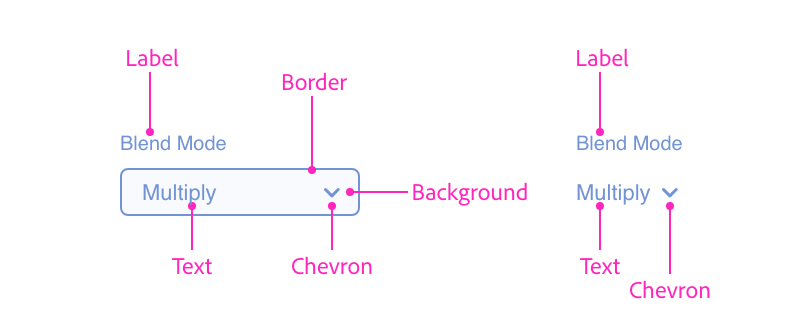
Anatomy
<style>
.row { align-items: center; }
</style>
<label>
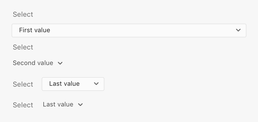
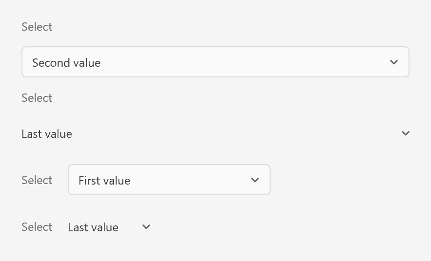
<span>Select</span>
<select>
<option value="1">First value</option>
<option value="2">Second value</option>
<option value="9">Last value</option>
</select>
</label>
<label>
<span>Select</span>
<select uxp-quiet="true">
<option value="1">First value</option>
<option value="2">Second value</option>
<option value="9">Last value</option>
</select>
</label>
<label class="row">
<span>Select</span>
<select>
<option value="1">First value</option>
<option value="2">Second value</option>
<option value="9">Last value</option>
</select>
</label>
<label class="row">
<span>Select</span>
<select uxp-quiet="true">
<option value="1">First value</option>
<option value="2">Second value</option>
<option value="9">Last value</option>
</select>
</label>Usage
You can render a typical dropdown using the following:
<label>
    <span>Target Artboard</span>
    <select>
        <option value="artboard-1">Icon</option>
        <option value="artboard-2">Thumbnail</option>
        <option value="artboard-3">Preview</option>
    </select>
</label>
<label>
    <span>Target Artboard</span>
    <select uxp-quiet="true">
        <option value="artboard-1">Icon</option>
        <option value="artboard-2">Thumbnail</option>
        <option value="artboard-3">Preview</option>
    </select>
</label>
const labelWrapper = document.createElement("label");
const label = document.createElement("span");
label.textContent = "Target Artboard";
const select = document.createElement("select");
select.uxpQuiet = true; // if you want a quiet dropdown
const options = [
["artboard-1", "Icon"],
["artboard-2", "Thumbnail"],
["artboard-3", "Preview"]
].map(([val, text]) => {
const el = document.createElement("option");
el.setAttribute("value", val);
el.textContent = text;
return el;
});
options.forEach(opt => select.appendChild(opt));
labelWrapper.appendChild(label);
labelWrapper.appendChild(select);function render() {
return (
<div>
<label>
<span>Target Artboard</span>
<select>
<option value="artboard-1">Icon</option>
<option value="artboard-2">Thumbnail</option>
<option value="artboard-3">Preview</option>
</select>
</label>
<label>
<span>Target Artboard</span>
<select uxp-quiet="true">
<option value="artboard-1">Icon</option>
<option value="artboard-2">Thumbnail</option>
<option value="artboard-3">Preview</option>
</select>
</label>
</div>
);
}Guidelines
Include a Label
Dropdowns should always have a label — otherwise the dropdown can be ambiguous. There are occasions where context may make what the dropdown does obvious (for example, a sort-by dropdown).
Label Position
Ensure that the label is rendered above or to the left of the dropdown. When rendering labels to the left, you can use code like the following:
<style>
    .row { align-items: center; }
</style>
<label class="row">
    <span>Order</span>
    <select>...</select>
</label>
Truncation
Avoid truncating items by ensuring that the dropdown is wide enough for the longest item.
Capitalization
The dropdown's label should use title case, while the items themselves should use sentence case.
Keyboard
| Key | Action |
|---|---|
| SPACE | Displays the dropdown (if closed) or selects the highlighted item |
| UP ARROW | Displays the dropdown (if closed) or selects the previous item in the select list |
| DOWN ARROW | Displays the dropdown (if closed) or selects the next item in the select list |
| ENTER | Submits the active form (if dropdown is closed) or selects the highlighted item |
| TAB | Navigates to the next focusable control |
| SHIFT+TAB | Navigates to the previous focusable control |
Styling
Dropdowns accept a limited amount of styling. You cannot change the following styles:
- Minimum width
- Font family, color, or weight
- Height
- Position of the chevron
- Color of the dropdown's border or chevron
- Background color
Attributes
Supported Attributes
disabledvalueautofocus:autofocusuxp-quiet:true
Unsupported Attributes
autocompleteformformactionformenctypeformmethodformnovalidateformtargetname
Supported Events
change
Known Issues
- Dropdowns do not receive keyboard or pointer events.
<select value="…"/>does not show the value as selected. Instead, get a reference to the element and callsetAttribute("value", …).<option>tags must have avalueattribute, or referencing theselect'svalueproperty will returnundefined.<option>tags do not support thedisabledattribute.