Text Fields
Text fields allow user input for custom values. Text fields can be single or multi-line input fields, and come in various degrees of loudness.
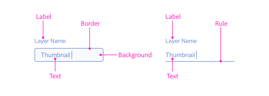
Anatomy
<input type="text" />Usage
You can render a typical single-line textfield using the following:
<label>
    <span>Layer Name</span>
    <input type="text" placeholder="Enter a layer name"/>
</label>
const labelWrapper = document.createElement("label");
const label = document.createElement("span");
label.textContent = "Layer Name";
const textfield = document.createElement("input");
textfield.setAttribute("type", "text");
textfield.setAttribute("placeholder", "Enter a layer name");
labelWrapper.appendChild(label);
labelWrapper.appendChild(textfield);function render() {
return (
<label>
<span>Layer Name</span>
<input type="text" placeholder="Enter a layer name"/>
</label>
);
}Variations and Loudness
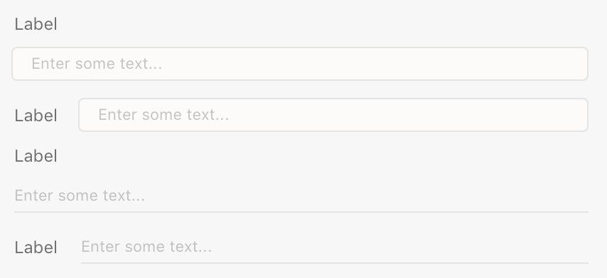
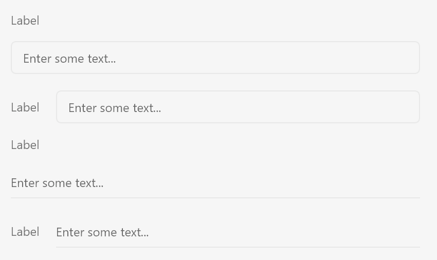
Text fields have a standard rendition (with borders) and a quiet rendition (with a border at the bottom of the control). This is controlled with the uxp-quiet attribute.
- If
uxp-quietis omitted, the text field will draw with a border around the entire control. - If
uxp-quietistrue, the text field will draw with only a border at the bottom of the control.
Single line text fields are created using the input type="text" tag. Multiline text fields are created using the textarea tag, like so:
<textarea>
Default text value here
</textarea>
HTML5 allows you to specify the width and height of a textarea element using the rows and cols attributes. XD only uses the width and height styles.
Behavior
In panel UI
- When the user presses Escape or Enter in a text field, keyboard focus is sent back to the design canvas. You can prevent this by calling
preventDefault()on thekeydownevent. - To return keyboard focus to the design canvas programmatically, call
blur()on whichever text field in your panel UI is currently focused.
In dialog boxes
- Pressing Escape in any text field closes the dialog, resolving
showModal()'s Promise with the string"reasonCanceled". This cannot be prevented.
Guidelines
Include a Label
Text fields should always have labels, otherwise it is difficult for the user to discern what the field expects.
Label Position
Typically, labels should be above the text field and positioned to the left. You can also position labels directly to the left if you need.
Left-positioned label example
<style>
    .field {
        align-items: center;
    }
</style>
<label class="row field">
    <span>Layer Name</span>
    <input type="text" />
</label>
Minimum Width
Text fields should not be sized so much smaller than the typically expected value. Narrow text fields require a lot of user scrolling, and can lead to user confusion because the entire value may not be visible.
Capitalization
The text field labels should be in title case. Placeholder text should be in sentence case.
Keyboard
| Key | Action |
|---|---|
| ENTER | Submits the active form |
| TAB | Navigates to the next focusable control |
| SHIFT+TAB | Navigates to the previous focusable control |
Styling
Text fields accept a limited amount of styling. You cannot change the following styles:
- Color of the border or the background color
- The font family, weight, or size
- The padding within the text area
Attributes
Supported Attributes
autofocus:autofocusdisabled:disabledreadonly:readonlyvaluemin,max,step(Number fields)
Unsupported Attributes
autocompleteformformactionformenctypeformmethodformnovalidateformtargetnamedefaultValueminlengthmaxlengthcaptureinputmodelistmultiplepatternrequiredsizespellchecktabindexusemap
Supported Events
change
Known Issues
- Text fields do not receive pointer events.
- Validation is not currently supported.
- The following
inputtypevalues are not supported, and will render as a regular text field:button,color,date*,email,file,hidden,month,radio,reset,submit,tel,time,url,week