Flexbox Layout
The flexible box layout module is a layout system provided in CSS, which is significantly more flexible than using block layout. The layout module provides the ability for elements to shrink and grow based on available space, and also provides methods for specifying how much space to provide around elements.
The flexible box module specification is quite large, and covering the entire specification is out-of-scope for this reference. If you want all the details, please refer to the following documentation:
- A Complete Guide to Flexbox
- Basic concepts of flexbox
- CSS Flexible Box Layout
- CSS Flexible Box Layout Module Level 1 (W3C Specification)
Enabling flexible layout
There are two types of elements when using flexible layout. First, there is the containing element — this is called the "flex container". Then there is the element that is being positioned within the flex container which are called "flex items".
To turn an element into a flex container, one applies display: flex to the element. The orientation of the element defaults to the horizontal or row orientation, but can be overridden by specifying flex-direction: row | column | row-reverse | column-reverse. Whether or not wrapping should be allowed is controlled with flex-wrap (which defaults to nowrap, but can be set to wrap and wrap-reverse).
All direct descendants within a flex container are flex items automatically. The spacing and positioning of these elements is controlled using the following styles:
justify-content: indicates the rules to apply to spacing on the main axis; defaults toflex-startalign-content: indicates the rules to apply to spacing on the cross axis; defaults tostretchalign-items: defaults tostretchalign-self: defaults toauto
How items stretch and position themselves is determined by the item's flex properties:
flex-basis: indicates the size of the flex item (defaults toauto)flex-grow: indicates the growth factor of the flex item (in comparison to other flex items; defaults to0)flex-shrink: indicates the shrink factor of the flex item (in comparison to other flex items; defaults to1)
It might help to visualize the above with some diagrams. First, let's look at the flex properties. In the following image, each box is being given a flex: 1 1 auto (or flex: 2 2 auto, depending on the number).
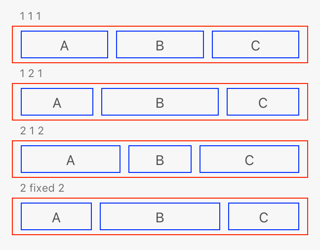
As you can see, the items that received flex: 2 2 auto are larger than the flex: 1 1 auto counterparts. And the last item has a fixed flex-basis supplied, which override the default size calculation.
Now, consider the following HTML and styles:
<style>
     .border {
         border: 1px solid red;
         padding: 4px;
         width: 300px;
     }
     .flex {
         display: flex;
         flex-direction: row;
     }
     .between { justify-content: space-between; }
     .around  { justify-content: space-around; }
     .start   { justify-content: flex-start; }
     .end     { justify-content: flex-end; }
     .center  { justify-content: center; }
     .border * {
         border: 1px solid blue;
         padding: 4px;
         margin: 0 4px;
     }
</style>
<h3>FLEX, SPACE-BETWEEN</h3>
<div class="border flex between">
    <div>A</div><div>B</div><div>C</div>
</div>
<h3>FLEX, SPACE-AROUND</h3>
<div class="border flex around">
    <div>A</div><div>B</div><div>C</div>
</div>
<h3>FLEX, FLEX-START</h3>
<div class="border flex start">
    <div>A</div><div>B</div><div>C</div>
</div>
<h3>FLEX, FLEX-END</h3>
<div class="border flex end">
    <div>A</div><div>B</div><div>C</div>
</div>
<h3>FLEX, CENTER</h3>
<div class="border flex center">
    <div>A</div><div>B</div><div>C</div>
</div>
Given the above, XD will generate the following rendition:
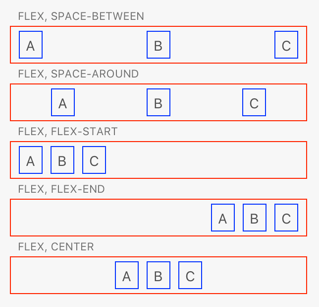
As you can see, the spacing between flex items can also be controlled.
Combined, the flexible size and spacing of items can enable very complex layout with only a little CSS. That said, it's important not to overuse flexbox layout. The calculations are significantly more complex than both block layout and relative or absolute positioning, and if you have a lot of elements rendered, performance may suffer.
If you know the size of the flex item, you can speed up the calculations by using a non-auto value for flex-basis
Unsupported styles and values
The following values are unsupported for each style:
| Style Rule | Unsupported Values |
|---|---|
justify-content |
start |
end |
|
left |
|
right |
|
space-evenly |
|
safe |
|
unsafe |
|
normal |
|
stretch |
|
align-content |
start |
end |
|
space-evenly |
|
safe |
|
unsafe |
|
normal |
|
baseline |
|
first |
|
last |
|
align-items |
start |
end |
|
self-start |
|
self-end |
|
safe |
|
unsafe |
|
normal |
|
baseline |
|
first |
|
last |
|
align-self |
start |
end |
|
self-start |
|
self-end |
|
safe |
|
unsafe |
|
normal |
|
baseline |
|
first |
|
last |
|
place-content |
No support |
gap |
No support |
column-gap |
No support |
row-gap |
No support |
flex-flow shorthand |
No support; use flex-direction and flex-wrap |