Tooltips
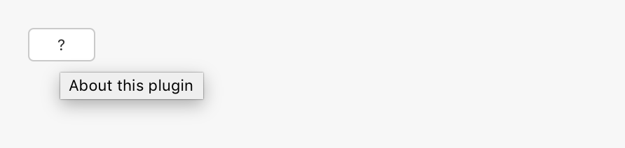
Tooltips are used to provide additional context or help about an element. They appear when the user hovers over the item with their mouse for a short period o time.
Tooltips are automatically enabled when you use the title attribute with an element. For example:
<button title="More information" />
Guidelines
When to Use Tooltips
- Don't use tooltips when the context or intent is already clear. For example, a "Print" button doesn't need a tooltip.
- Use tooltips when iconography is present without corresponding visual text. For example, a warning icon could have a tooltip that indicates that a field is invalid.
Maximum Size
Tooltips should be as short and concise as possible. Keep tooltips to a few words.