How to migrate from modal to panel
Are you interested in converting your plugin's modal dialog box UI into a panel UI? Keep in mind that not every modal dialog flow is a good fit for this change. If you are curious about what differences exist, take a look at the docs for each UI entrypoint:
If you determine your modal-based plugin would be even better as a panel, read on!
Prerequisites
- Basic knowledge of HTML, CSS, and JavaScript
- Modal Quick Start Tutorial
- Panel Quick Start Tutorial
- Debugging Tutorial
Sample code
The complete example can be found in our Samples repository.
Development Steps
We are going to take a look at a sample plugin that lets users increase the width and height of the selected rectangle by inputting pixel values in the UI. As you can imagine, this process would be more efficient for the user if the plugin provided UI in a panel.
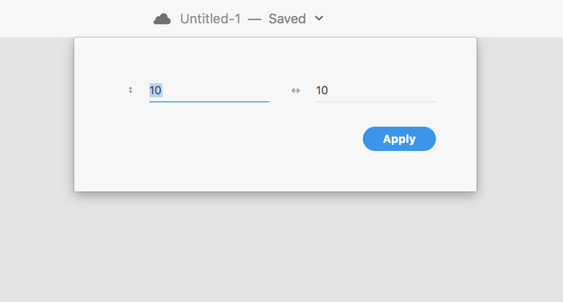
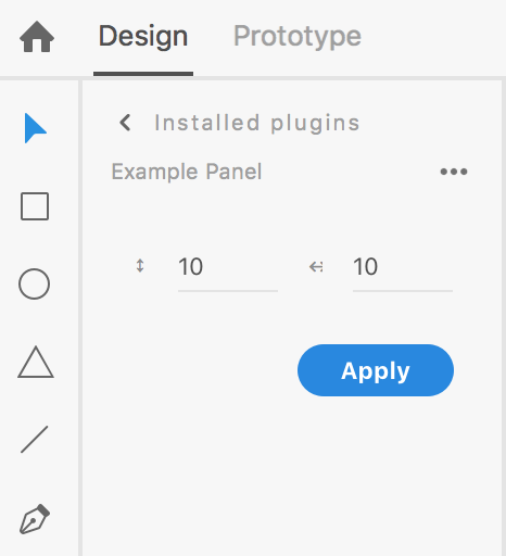
Let's see what this plugin will look like before and after:
As a modal
As a panel
Now, let's go through the steps of converting a modal plugin to a panel-based plugin.
1. Open your modal plugin code
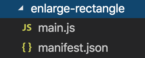
Note that your plugin structure does not change. Just like with modal plugins, the minimum required files for your panel plugin to work are main.js and manifest.json.
You might have more files than this, depending on how you have structured your plugin.
2. Change uiEntryPoints and host.minVersion of your manifest.json
Let's take a look at both cases.
Modal:
"host": {
        "app": "XD",
        "minVersion": "15.0"
},
"uiEntryPoints": [
        {
            "type": "menu",
            "label": "Enlarge a Rectangle",
            "commandId": "enlargeRectangle"
        }
    ]
Panel:
"host": {
        "app": "XD",
        "minVersion": "21.0"
},
"uiEntryPoints": [
        {
            "type": "panel",
            "label": "Enlarge a Rectangle",
            "panelId": "enlargeRectangle"
        }
    ]
As you can see, host.minVersion is changed to 21.0 since 21.0 is the earliest version of XD that supports panels. Also, uiEntryPoints needs to be updated as well. The type key should be changed to panel and commandId key needs to be changed to panelId.
3. Understand the new structure of main.js
A modal-dialog command needs one function to be exported:
function enlargeRectangle() {
  // your code here
}

module.exports = {
  commands: {
    enlargeRectangle
  }
};
Plugin panel UI, on the other hand, requires you to export an object with one required lifecycle method named show, and with optional lifecycle methods name hide and update:
function show(event) {
  // your code here
}

function hide(event) {
  // your code here
}

function update(selection) {
  // your code here
}

module.exports = {
  panels: {
    enlargeRectangle: {
      show,
      hide,
      update
    }
  }
};
Review the specifics of these panel lifecycle methods in the panel-object API reference before moving on.
3. Review your modal main.js code
Let's first look at the main.js file of your original modal-dialog plugin:
const { selection } = require("scenegraph"); // [1]
let dialog;

function enlargeRectangle() { // [2]
  const html = `
<style>
    .break {
        flex-wrap: wrap;
    }
    label.row > span {
        color: #8E8E8E;
        width: 20px;
        text-align: right;
        font-size: 9px;
    }
    label.row input {
        flex: 1 1 auto;
    }
    form {
        width:90%;
        margin: -20px;
        padding: 0px;
    }
</style>
<form method="dialog" id="main">
    <div class="row break">
        <label class="row">
            <span>↕︎</span>
            <input type="number" uxp-quiet="true" id="txtV" value="10" placeholder="Height" />
        </label>
        <label class="row">
            <span>↔︎</span>
            <input type="number" uxp-quiet="true" id="txtH" value="10" placeholder="Width" />
        </label>
    </div>
    <footer>
        <button id="ok" type="submit" uxp-variant="cta">Apply</button>
    </footer>
</form>
`;

  function increaseRectangleSize() { // [3]
    const height = Number(document.querySelector("#txtV").value); // [4]
    const width = Number(document.querySelector("#txtH").value);
    const selectedRectangle = selection.items[0]; // [5]
    selectedRectangle.width += width; // [6]
    selectedRectangle.height += height;
  }

  if (!dialog) {
    let dialog = document.createElement("dialog"); // [7]
    dialog.innerHTML = html; // [8]
    document.appendChild(dialog); // [9]
    document.querySelector("form").addEventListener("submit", increaseRectangleSize); // [10]
  }

  return dialog.showModal(); // [11]
}

module.exports = { // [12]
  commands: {
    enlargeRectangle
  }
};
This code does the following:
- Gets reference to the
selection. - Creates a
constcalledhtmland stores your UI markup, including elements forstyle,form, and so on. Theformtag contains adivwhich includes two text input fields and afooterwhich has a button for users to click on. Theptag contains warning text which is used to warn users when they select a non-rectangle node inside the active XD document. - Creates a nested function called
increaseRectangleSize. - Gets user input value from the "height" and "width" input elements.
- Gets the first currently selected node. (Some UI logic will be added later to ensure this is a rectangle.)
- Modifies the
widthandheightof the selected rectangle. - Creates a
dialogelement. - Attaches the HTML created in step #1.
- Attaches the
dialogelement created in step #8 to the DOM. - Adds a submit listener for the form element, attaching the
increaseRectangleSizefunction created in step #2. - Returns a JavaScript Promise which will resolve when the dialog is dismissed by the user.
- Exports the main function.
4. Modify the main.js file
Let's start modifying code in the main.js file.
Warn the user about invalid selections
Your HTML markup does not have to change, but let's add a p tag to show a warning message if the user has selected a node that's not a rectangle:
<p id="warning">
  This plugin requires you to select a rectangle in the document. Please select
  a rectangle.
</p>
Unlike modal UI, panel UI can stay open and persistent, optionally updating in real time based on a user's selection.
Request to make changes to the scenegraph
Unlike menu commands, which have just a single entry point the user can trigger to run the command, panel plugins have many different ways that the user can interact with their DOM elements to trigger an action. As a result, your panel UI event handlers must call special function when you want to make changes to the XD document.
Any part of your panel that makes changes to the scenegraph needs to be wrapped in an application.editDocument call:
const { editDocument } = require("application");

editDocument({ editLabel: "Increase rectangle size" }, function(selection) {
  const selectedRectangle = selection.items[0];
  selectedRectangle.width += width;
  selectedRectangle.height += height;
});
Make a panel element
Now, instead of creating a dialog, let's create a panel element, insert the HTML, and add an event listener with the increaseRectangleSize function attached.
You can replace these lines of code:
let dialog = document.createElement("dialog");
dialog.innerHTML = html;
document.appendChild(dialog);
document.querySelector("form").addEventListener("submit", increaseRectangleSize);
return dialog.showModal();
... with this:
let panelContainer = document.createElement("panel");
panelContainer.innerHTML = html;
panelContainer.querySelector("form").addEventListener("submit", increaseRectangleSize);
event.node.appendChild(panelContainer);
If you're wondering where the event object in that last line came from, we'll have a look at that in the next section.
Your show lifecycle method: bring it all together
All of the main.js code we've modified so far will be the content of your show lifecycle method that runs when the plugin opens.
Note that the show and hide lifecycle methods for panel-based plugins receive an event argument. The event.node property is the DOM element where you can attach your panel UI for display in the application.
Here is our complete show method for this plugin:
let panel;

function show(event) {
  const html = `
<style>
    label.row > span {
        color: #8E8E8E;
        width: 20px;
        text-align: right;
        font-size: 9px;
    }
    label.row input {
        flex: 1 1 auto;
    }
    .show {
        display: block;
    }
    .hide {
        display: none;
    }
</style>
<form method="dialog" id="main">
    <div class="row break">
        <label class="row">
            <span>↕︎</span>
            <input type="number" uxp-quiet="true" id="txtV" value="10" placeholder="Height" />
        </label>
        <label class="row">
            <span>↔︎</span>
            <input type="number" uxp-quiet="true" id="txtH" value="10" placeholder="Width" />
        </label>
    </div>
    <footer><button id="ok" type="submit" uxp-variant="cta">Apply</button></footer>
</form>
<p id="warning">This plugin requires you to select a rectangle in the document. Please select a rectangle.</p>
`;

  function increaseRectangleSize() {
    const { editDocument } = require("application");

    const height = Number(document.querySelector("#txtV").value);
    const width = Number(document.querySelector("#txtH").value);

    editDocument({ editLabel: "Increase rectangle size" }, function(selection) {
      const selectedRectangle = selection.items[0];
      selectedRectangle.width += width;
      selectedRectangle.height += height;
    });
  }

  if (!panel) {
      panel = document.createElement("div");
      panel.innerHTML = HTML;
      panel.querySelector("form").addEventListener("submit", increaseRectangleSize);
      event.node.appendChild(panel);
  }
}
Your hide lifecycle method: tidying up
Next, let's add the optional hide lifecycle method, which runs when the panel UI becomes invisible:
function hide(event) {
  // This function triggers when the panel is hidden by user
}
Your update lifecycle method: staying aware as the user works
The update function is another optional lifecycle method that allows your plugin to dynamically respond to the user's selection changes.
We'll break this code down below:
function update(selection) { // [1]
  const { Rectangle } = require("scenegraph"); // [2]

  const form = document.querySelector("form"); // [3]
  const warning = document.querySelector("#warning"); // [4]

  if (!selection || !(selection.items[0] instanceof Rectangle)) { // [5]
      form.className = "hide";
      warning.className = "show";

  } else {
      form.className = "show";
      warning.className = "hide";
  }
}
This code does the following:
- Uses the
selectionargument.updateprovides two arguments,selectionandroot. This example only usesselection. - Gets reference to the
Rectangleobject imported from thescenegraphmodule. - Gets reference to the
formelement in your HTML. - Gets reference to the
pelement with the warning message. - Checks if the user has selected anything and if the selection is a rectangle. If this validation passes, the form appears and the warning message is not shown. If not, the warning message is shown to the user and the form disappears.
Next Steps
Now you have successfully converted your modal plugin to a panel plugin!
Ready to explore further? Take a look at our other resources: