Sliders
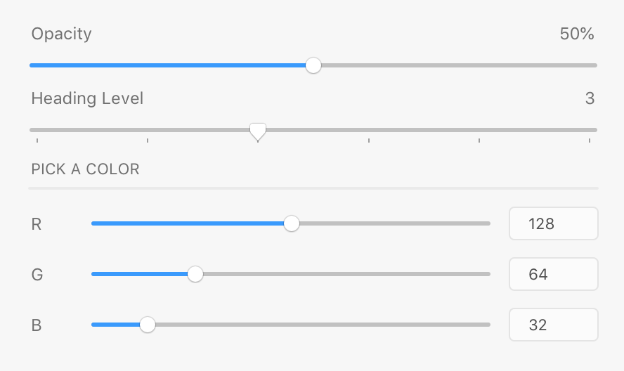
Sliders allow the user to pick from a continuum of values between a minimum and maximum value. Slider values are continuous by default, but may be discrete if desired (using the step attribute). Consider using text areas when the range of values is very wide, or when typing a value will be more precise than dragging a handle.
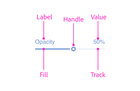
Anatomy
<style>
    .colorrow {
        display: flex;
        flex-direction: row;
        align-items: center;
    }
    .colorrow span {
        flex: 0 0 32px;
    }
    .colorrow input[type=text] {
        flex: 0 0 64px;
    }
    .colorrow input[type=range] {
        flex: 1 1 auto;
    }
    .spread {
        justify-content: space-between;
    }
</style>
<label>
    <div class="row spread">
        <span>Opacity</span>
        <span>50%</span>
    </div>
    <input type="range" min=0 max=100 value=50 />
</label>
<label>
    <div class="row spread">
        <span>Heading Level</span>
        <span>3</span>
    </div>
    <input type="range" min=1 max=6 value=3 step=1 />
</label>
<h3>PICK A COLOR</h3>
<hr />
<label class="colorrow">
    <span>R</span>
    <input type="range" min=0 max=255 value=128 />
    <input type="text" value="128" />
</label>
<label class="colorrow">
    <span>G</span>
    <input type="range" min=0 max=255 value=64 />
    <input type="text" value="64" />
</label>
<label class="colorrow">
    <span>B</span>
    <input type="range" min=0 max=255 value=32 />
    <input type="text" value="32" />
</label>
Usage
You can render a typical slider using the following:
<style>
    .spread { justify-content: space-between; }
</style>
<label>
    <div class="row spread">
        <span>Opacity</span>
        <span>50%</span>
    </div>
    <input type="range" min=0 max=100 value=50 />
</label>
const labelWrapper = document.createElement("label");
const label = document.createElement("span");
label.textContent = "Opacity";
const displayValue = document.createElement("span");
displayValue.textContent = "50%";
const labelAndDisplay = document.createElement("div");
labelAndDisplay.className = "row";
labelAndDisplay.style.justifyContent = "space-between";
labelAndDisplay.appendChild(label);
labelAndDisplay.appendChild(displayValue);
const slider = document.createElement("input");
slider.setAttribute("type", "range");
slider.setAttribute("min", "0");
slider.setAttribute("max", "100");
slider.setAttribute("value", "50");
labelWrapper.appendChild(labelAndDisplay);
labelWrapper.appendChild(slider);function render() {
return (
<label>
<div className="row" style={{justifyContent: "space-between"}}>
<span>Opacity</span>
<span>50%</span>
</div>
<input type="range" min=0 max=100 value=50 />
</label>
);
}Guidelines
Include a Label and a Value
Sliders should always have a label and value. The value may be simple text, or it may be an editable text field (such as in a color picker).
Label and Value Position
Ensure that the label is rendered above or to the left of the dropdown. When rendering labels to the left, render the value to the right.
Value Units
Be sure to include the appropriate unit (such as a percent sign or "px", "in", etc.), unless rendering the value in a text field.
Positive and Negative Values
Be sure to include the sign on all values. When using a text-only display, add a space between the sign and the value for readability (e.g., "- 32%" or "+ 64%"). When using a text field, display the sign, but there's no need for an intervening space.
Capitalization
The slider's label should use title case.
Keyboard
| Key | Action |
|---|---|
| UP ARROW | Increases the slider's value (the amount is platform-dependent) |
| RIGHT ARROW | Increases the slider's value (the amount is platform-dependent) |
| LEFT ARROW | Decreases the slider's value (the amount is platform-dependent) |
| DOWN ARROW | Decreases the slider's value (the amount is platform-dependent) |
| ENTER | Submits the active form |
| TAB | Navigates to the next focusable control |
| SHIFT+TAB | Navigates to the previous focusable control |
Styling
Sliders accept a limited amount of styling. You cannot change the following styles:
- Height
- Color of the slider's track, fill, or handle
Attributes
Supported Attributes
disabledvaluemin: the minimum valuemax: the maximum valuestep: if specified, the slider will return discrete values snapped to this valueautofocus:autofocus
Unsupported Attributes
autocompleteformformactionformenctypeformmethodformnovalidateformtargetname
Supported Events
change
Known Issues
- Sliders do not receive keyboard or pointer events.